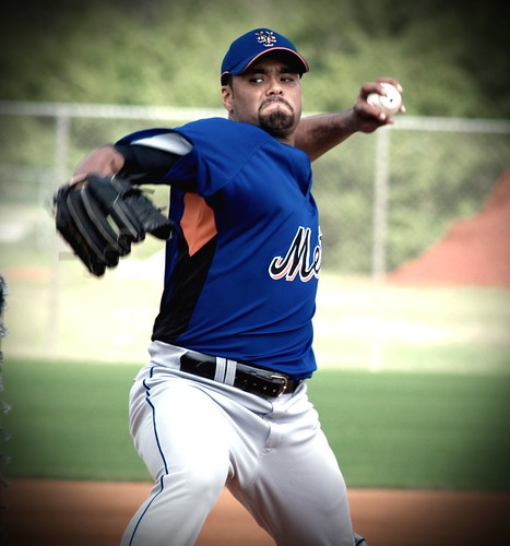
 I’m kinda fried this morning, but have a few neat items to develop, just not yet. Â As the coffee kicks in let’s ponder this jersey Santana is wearing (photo from MetsBlog.)
As regular readers know, I wish the Mets would wear traditional colors and get rid of the scourge that are black Mets uniforms. Â However, I will not be a complete Nazi, and if on a spring training day they insist on wearing orange, green or even black letters on blue (like in the photo) I will deal with it. Â I even thing the black NY on blue looks way better than the blue NY on a black cap.
I know the idea is to sell more merchandise (remember everyone, this is a business) but even if you wanted to buy one of these, wouldn’t you prefer it without the extra layers of visual noise?
However, why does MLB/Mets/Uniform Maker have to go the extra mile and add the ugly orange underarm? Â What does that add? Â What does the black stripe add other than it makes Santana look fat in this photo?
I need to find some time this weekend to watch the Olympics Ceremonies, today’s events, some Nascar races, and the three episodes of Mets Yearbook that I haven’t watched yet. Â With Valentine’s Day in the middle. Â Seems challenging. Â Off to have some coffee.
If you’d like to join the free fan-meetup on Opening Day we’ll be happy to see you.
the orange is part of the “new” jersey “technology” that these jersey makers are using now. Hockey jerseys are like that now too with a thinner quick dry under arm area. 90 percent of the jerseys in hockey and baseball do not have the different colored piece of material. They usually have the piece match the rest of the jersey..
im all for the sweat drying quickly…but why make it orange>
I hate it but I can live with the orange, at least it is a Mets’ color…unlike the black. I could live with most of the practice crap, if they looked like the Mets during games…pinstripes at home…grey on the road.
agreed. i’d even live with looking like clowns on Sunday if they would class it up the other 6.