I mentioned yesterday that I need a new blue Mets cap. Â Here are some I looked at on Sunday afternoon.
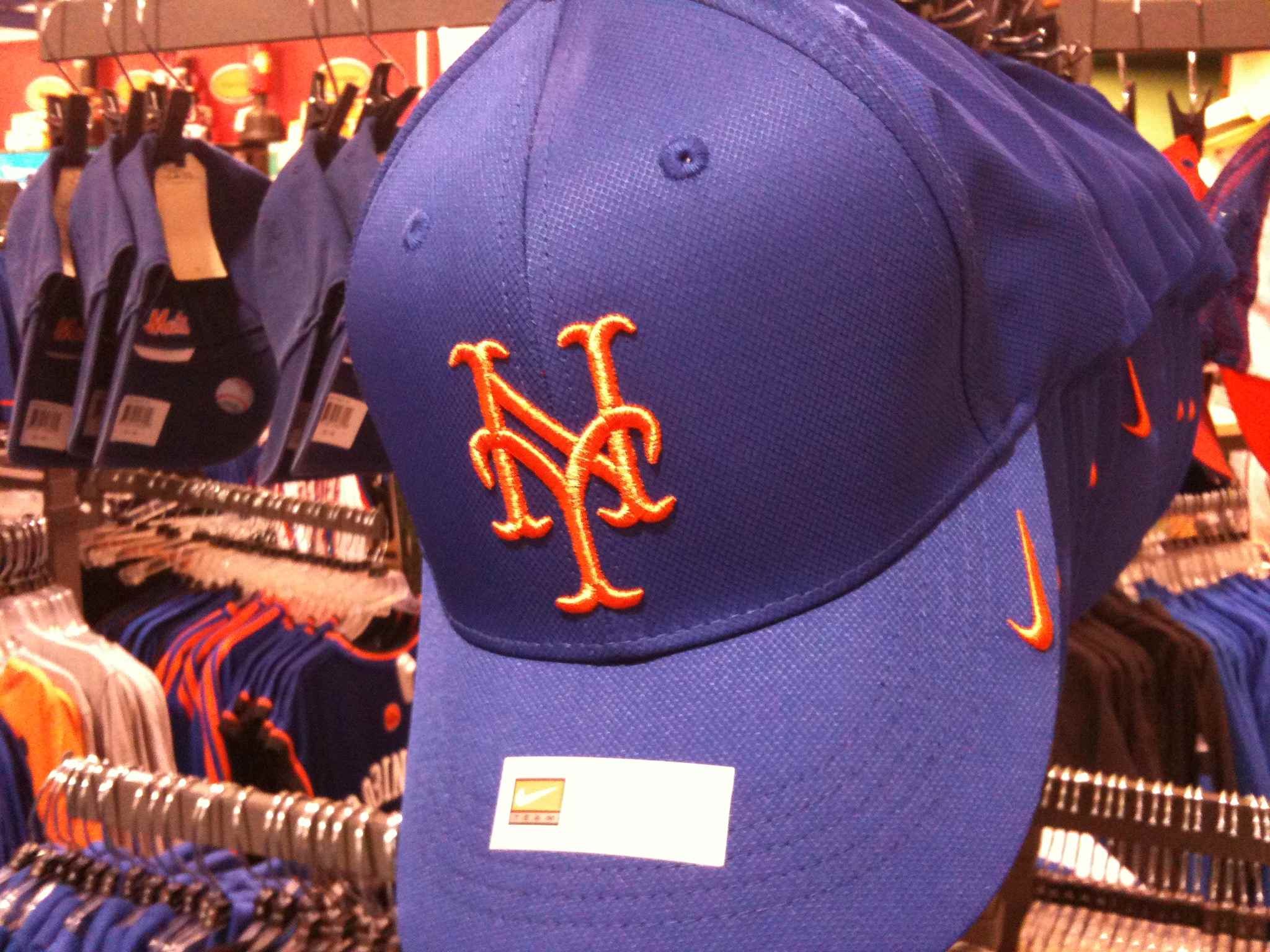
Care to take one guess what’s wrong with the first cap? No swoosh for me. It’s too shiny as well.
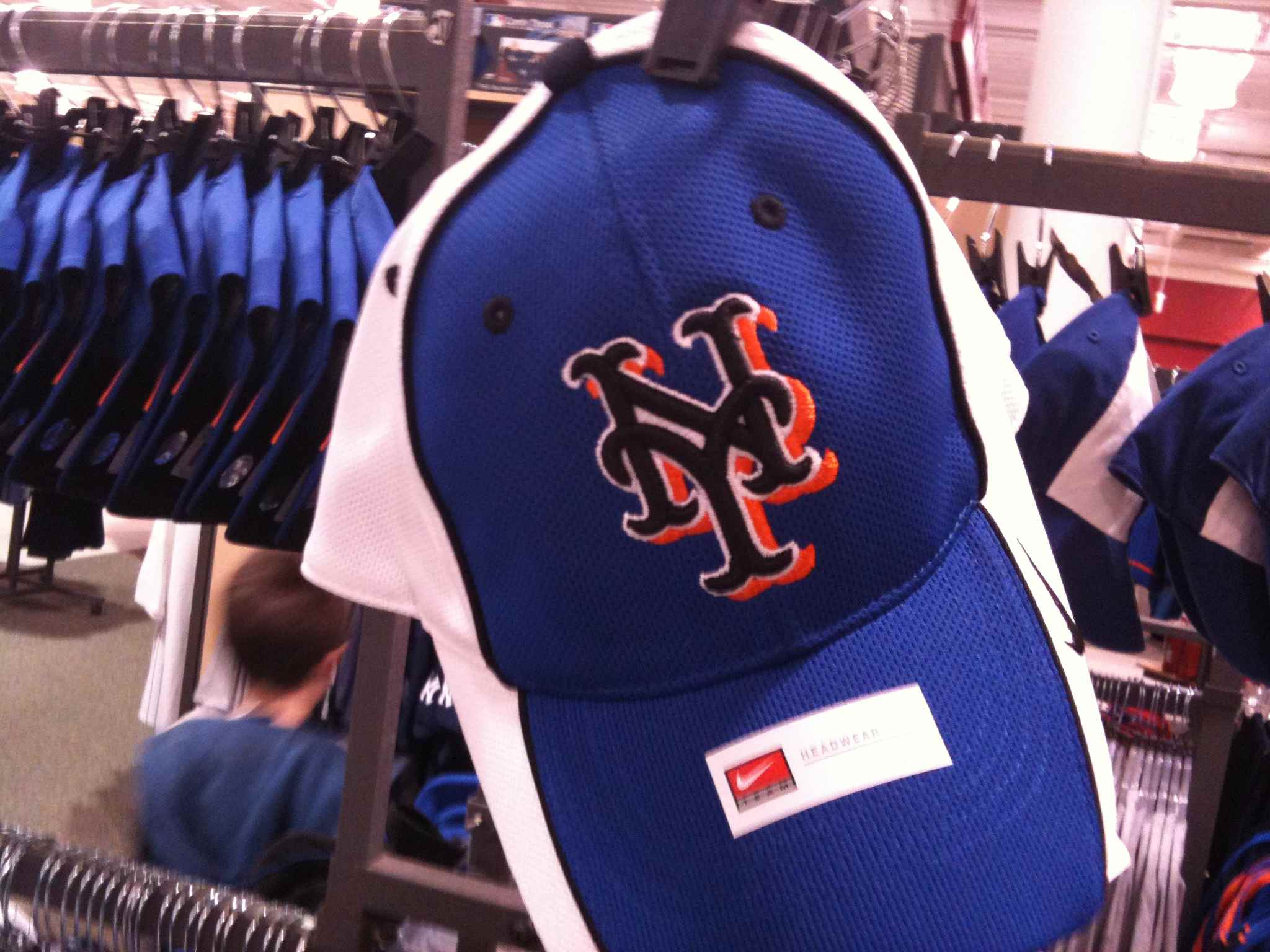
The second one was never a consideration, but much like a unicorn I had to take a picture in case we never see the likes of it again. It combines the worst of the 70’s with the worst of the ’00s. No thanks.
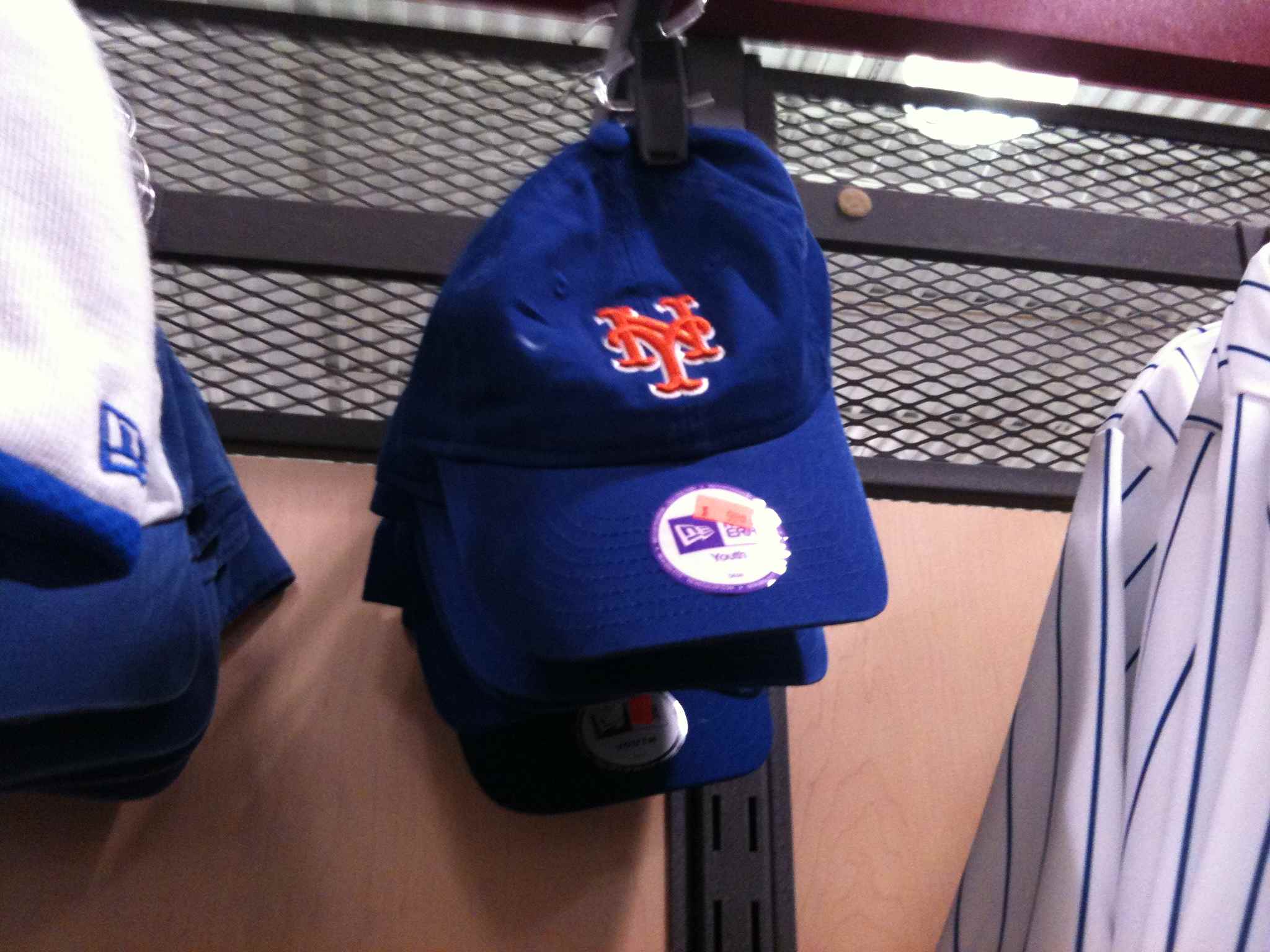
The third one is a youth hat. The white undershadow is interesting. It isn’t traditional but it’s not awful. Since the franchise seems obsessed with dropshadow, perhaps when we finally all sign the Treaty of Flushing I can hold out for 1983 style blue jerseys, and I can concede white dropshadow to Mr. Howard.
Finally, I apparently forgot to take a picture of the cap I actually like. It is called a “franchise” cap and it looks like it has traveled through time from 1977. The blue is lighter, like from my youth, and the NY is somewhat flat to the cap. This is a stock photo from lids.com I might have to buy this one once I see what Osh41 (my cap consultant) has to say after he reads this. They only had it in medium and I have a giant head so I didn’t get it yet.
What are you guys wearing? Send in some pics. [email protected]
I actually like that 3rd one. If the Mets rolled it out on the team for 2011, I wouldn’t protest. The white outline for a return of the blue button is a fair trade in my book.
Yes, I have this fantasy that we all meet in a railroad car. Dave Howard and Jeff Wilpon on one side of the table, the Blue Cap Army on the other side. We all sign documents banning the black and agreeing not to complain. I would concede the white outline if that’s what it takes. We sign the papers and I shut down the site and we all go off and attend games. It’s sort of like the end of Battlestar Galactica.
Don’t forget Mets Police Junior’s Blue Cap Army initial issue uniform
http://shop.mlb.com/product/index.jsp?productId=2906392&cp=1452359.1452831.715036
done. thanks 40% off sale!
If you can get one I recommend last years spring training cap (New Era 3930 or something like that). Very comfortable and sharp…
i have one of those. Im not nuts about the loops on the sides. The best of the BP caps was the 2008.
Shannon, I would have to strongly urge you to look into the 59Fifty Low Crown cap. After wearing an unstructured BLUE Mets cap for years I found myself wanting something more authentic. Also, the unstructured faded ones can look kind of silly with a jersey IMHO. I tried the regular 59 Fifty cap on at the mall and I felt like I had put on a 10 gallon cowboy hat; way too tall. So I looked online and found that 59Fifty makes a lower profile cap. Looking at the player profile pictures on mets.com, it looks like some players might actually wear the low profile cap. Santana comes to mind.
Sean that’s a great suggestion. I will check it out. I have tons and tons of caps (of all kinds) so it’s not absurd to think I would have two new caps. I’m regretting I didn’t buy that Seaver jersey. I may have to.