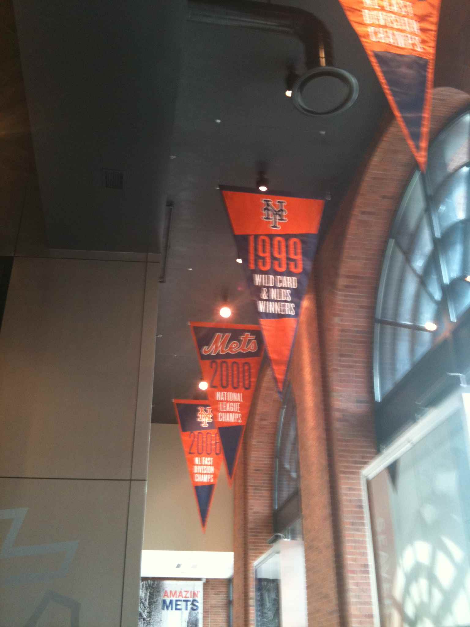
 One thing that is catching my eye at Citi Field in 2010 is how blue and orange everything is. Â They are using the phrasing in marketing and it is used in the museum.
The throwback uniforms looked fantastic on Monday (much less yellow than they look at Modell’s).
Next year will be the 50th season of the franchise.
All that seems to me to think the prevailing wind is heading toward tradition, and traditional colors.
Take a look at this picture Metsblog posted.
It would not surprise me to see the color black dropped – no dropshadow, no hybrids. Â This is pure conjecture on my part, but this blog is about putting ideas out there. Â What say ye?
UPDATE: I can always tell when Metsblog links (thanks Matt) because traffic goes way up. Â If you are new, welcome…poke around we have plenty of pics of the museum, I hope you come back, and I am encouraging everyone to subscribe via free daily email or google reader.


I like the idea. the black highlight or drop shadow isn’t a bad thing though. but when they start reversing the colors or the black jerseys is when i say “enough”.
Well, you know it doesn’t bother me. I even like the dropshadow. The Jersey’s aren’t great, but I wouldn’t mind if they rolled ’em out occasionally. And by occasionally I mean 4-6 games or so. once a month. something like that. But I could see them going more traditional for the 50th year. That’d be cool.
There’s just no need for the black dropshadow. It adds nothing.
Mothball everything black until 2020 and then have “2000 Mets Day” and wear special retro-clack uniforms and invite Bobby V back.
that would be a welcome site! although i’ve been fooled by their de-emphasis on marketing material before, i hope the see the writing on the wall here. it’s great that the black defines the ’99-’00 seasons in our minds, but it doesn’t make it a great uniform. it just means historic things happened (ventura’s grand slam single, for one) while the team looked like garbage.
just like the racing stripes define the ’80s, the black unis should define their moments in the past. it’s all about brand consistency. give me the cream pinstripes with dropshadow, road greys without dropshadow, blue caps ONLY and if you want an alternate, a blue one would be perfect.
i’d like to see them move towards an all-blue alternate jersey (not quite the early/mid 80s style with the orange/white trip and/or stripes) with the orange/white logo and lettering. not exactly the current BP jersey though, more like what they had in the mid 90s.
DyHrd: The blue alternate makes sense. If the argument for black is financial, selling a new jersey would seem to counter-argue the point.
I’m in the minority, but I WANT the black jerseys kept.
The Mets clinched the NL East in ’06 while wearing the black ones.
And I seem to remember Charlie Samuels calling it “the lucky black jersey.”
Rich welcome. We’ll agree to disagree. Over the weekend UniWatch posted the stats from 2009, the luck has worn off.
Lotta blue and orange in the stands Monday, loved seeing it. I was surprised by how much I liked the new jerseys, too (for me, the shadow has to go). Never was a fan of the shadow or alternate black caps, jerseys, etc. Perhaps because I always associate the Mets with the unis of the late 60’s, early 70’s. Just classic. While waiting to get into the Mets HOF, I waited behind a guy who was wearing an Ordonez road jersey from … well, before they added the shadow. Man, that was a sweet looking jersey. For my money, if they keep the ‘cream’ colored jerseys, and lose the shadow on both home and road jerseys, I start buying them again.
Continue the campaign, Shannon!
I’m sure I’m in the minority, but I think that black should have been one of the official colors all along by fully embracing their Giant and Dodger colors. Although I’m not big on the black jersey (I think it is okay, but prefer either the white or grey more) I do prefer the black caps to the blue one. I would make a modification to the black with blue bill though. I’d get rid of the blue around the NY logo and just make it orange on black. Easier to see on TV. Or you can scrap that cap and just keep the all-black one.
Michael, I agree that the all-black cap is easier to see on TV. That reason is why I particularly dislike the hubrids as I call them.
An orange on black would also look better.
However, that belongs to another team and time. Blue and orange belong to the Mets. Own it, Mets. Be proud of what yoy are!
I would be fine with losing the black jerseys. I used to really like them, but now I don’t really care for them anymore. But lets talk about caps for a minute. Am I the only one that hates the black cap with the blue brim? Man, do I hate it. I think they should just use the royal blue caps all the time. I remember one game last year they wore the royal blue caps with the road uniforms and they looked sharp! Even Keith said so.
As long as the Mets seem to be doing the whole tradition thing, I think it makes sense to lose the black caps with the blue brims.
Paul Lukas is right once again. DITCH THE BLACK! Metsies are blue and orange and white, and the many combinations thereof. Orange and black – SF. Blue and white – National League Los Angeles. Simple, easy, clean.
The colors of the City of New York. Blue, orange, white.
If the black uniforms go, then the outfield black wall has to go too. See all the signs from seating sections to make sure employess wash their hands to subway ads, they are all this dark blue. That would work fine in the outfield (with orange line).
So the black wall is suppose to be from the NY Giants, then instead somewhere put the Brooklyn Dodger “B” next to the interlocking NY of Giants (with black background) on the outfield wall. There you are showing everyone if they dont know already the origins of the Mets. Case closed, move on.
I’m getting that vibe, too, Shannon. I think black’s days are numbered, though they’ll probably keep it as a trim color.
I was surprised at how indifferent I was to the drop shadow on the new pins. It’d certainly be better without, but it doesn’t ruin them, either.
The hybrid caps are tolerable for the road, but they should never be worn at home again and have outlived their usefulness.
someone suggest a new poll question
I’m from England and the merchandise costs a fortune to ship over but I love it when you put pictures of caps, jerseys and other merchandise on. What particularly caught my eye today was on Ceetar’s photographs from Opening Day, on picture 103 there is a guy wearing a No.18 blue Mets jersey with the Mets script in white – it looks awesome! http://picasaweb.google.com/116718466727767270076/OpeningDay45#5456787182990479186
WOW! Finally! I sure hope that this is true. Ditching the Black completely and going with the basic Blue and Orange would be a godsend. Although, I can see the black color argument as possibly part of the Mets traditional colors due to the New York Giants, but it really has outlived its usefullness as a Mets color. I also understand the argument regarding keeping the black as part of what civilians wear, but on the field go with Blue and Orange only. Blue Caps always, even though I actually like the Black Fitted, but on the field they should disappear. If that happens Shannon, our dreams will finally come true!…again and as always BAN THE 2 TONE HYBRID its FUGLY! And it has to go at all costs!!!
ElPrimo – I’m with you. Sell all the black civilian-wear you want….and everyone buy one (Mets Police encourages you to support the Mets financially). Just look nice on the field.
The blue and orange around the park looks great.
New poll question? McFaddens: “Before or after the game?” best I could come up with at 4:40 on a wednesday.
I’m certainly not a fan of the black jerseys – I would be fine to see them go.
I think I was with everyone else, uni-wise, in the hopes that the cream jersey they had planned would be replacing the snow-whites, not just changing the pinstripes from white to beige.
In any case, I don’t really care about the dropshadow, &c. (beats the Torborg-era underline), and I’m even on the minority on the hybrid caps (I like ’em), but please, put the black jerseys to rest.
Also, a great idea they could establish: an actual schedule for when they’re wearing which jersey! (So I could coordinate what I’m wearing when I go to the ballpark.)
D.P. that schedule idea is a good one.
I’d like to hear once and for all who picks the unis. A beat writer told me it is Charlie, other folks have told me it is the pitcher.
I think it’s Charlie, unless Santana pipes up and wants to choose.