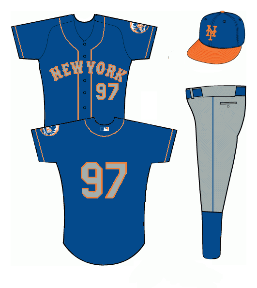
Here’s a note from Brian who has the same real job problem I have. Â Can’t we all just sit around and talk about what the Mets should wear and somehow get people to pay us? Â Surely that’s a marketable skill. Â As you read, when Brian says “yesterday” that’s now two days ago in your world because in your “yesterday” I had real job problems. Â Enough with the time paradoxes…here’s Brian.
Shannon,
Wanted to get this to you yesterday, but the REAL job got in the way…LAME!
Here’s a mock up I thought you might enjoy. This picture of Mike Piazza always makes me go, “Damn! That’s a nice looking jersey!” I’m assuming it was their road BP jersey in 1998. I think now is the perfect time to introduce a blue AWAY jersey. Since the black road one has been eliminated (and the Mets script on the road looks terrible), I thought this would be a perfect solution. We get a blue alternate, the Mets brass gets to keep their black alternate for home games and this would give the Mets a nice bump in merchandising sales. For the record, I would have the players’ names on the back, but I really need to get stuff done today and re-coloring the word “PLAYER” is not on the agenda. I also included a new alternate hat. Same crown as the blues just with an orange brim. I think THAT’S a sharp hybrid cap! Let me know what you think!
 Hmmm….as you will see me mention in several posts today, I’m actually writing on Wednesday night and quite sleepy. Â My brain doesn’t have the capacity to ponder this properly. Â I love blue jerseys…I will revisit this one when I am awake. Â In the meantime, you guys discuss. Â More DIY stuff coming as the day progresses (and yes UniWatch owns this and this is copycat, more on that later – I think – I can’t even remember what order I have things scheduled.)

This is very good looking. I actually have a similar jersey except it has “Mets” across the chest. The hat I could do without. Leave it all blue and it’s a great look.
Truthfully, I think that the grey away jersey is the best road jersey in the game and don’t think that what is, basically, a blue version looks as sharp. Also, I think that orange should be used for accent only and the orange on the bill makes the cap too loud. IMHO.
Sorry,didn’t care the gray lettering in the 80’s, and still think it is unappealing.
I have no problem with a blue jersey, just think orange letters, outlined in white works better with the blue background. Just like on the Mets logo
i actually agree. i prefer orange letters with a white outline. i just thought i’d mimick the piazza jersey in the photo for this concept.
i’m intrigued to hear nay votes to an orange brim. i always thought it would look pretty good. different strokes though!
love the feedback. thanks, guys!
I like the gray letters, but the orange piping would probably look a little too busy. I’m into elastic around the collar and elastic ends on the sleeves like the pullover jerseys from the 80’s. I just bought one of those replica blue alternates (Strawberry 18) and love it, but would love it more if it had gray letters. Overall, nice work, but the orange brim has to go.
A beautiful jersey, would love that. Although it seems like they do not want to ditch the black, why can’t they just add a jersey like this to the current set? Back when there was the black NY road jersey there were five jerseys, so why not? The only reason I could think of is because of the traditionalists complaining about too many jerseys (and yes there is too many but more jerseys= $$$$. I think that most Met traditionalists would be willing to trade off having five jerseys with at least the team wearing more blue. Or am I wrong?!
I like the black, and from what I’ve read from the marketing folks at the Mets loads of other folks do too. So, I’m thinking more blue isn’t going to happen any time soon. Just sayin’.
Michael I fear you are right but the BP jerseys are blue so one never knows.
Jamie as a traditionalist it’s such a long road back to 2 uniforms that I’d have to buy the team – and I’d probably roll out a blue jersey – and someone would have to start a blog about the new dopey ownership. Irony.
A mets hat with an orange bill? Bleh. Have you seen what the SFG hats look like? Bleh.
That jersey, on the other hand, I would buy right now.
I think this works if the cap were gray with a blue brim. Sort of like how the Pirates and Royals had it in the 90s. But yeah, as long as the Mets keep black in their team colors, a jersey with loud orange piping ain’t happenin.
Anyone realize they actually HAVE THIS since this post?!?! How awesome!!!