With yesterday’s news that no Mets jersey was in the top 20 sellers, I thought it might help the marketing department to consider that perhaps their product has gone stale.
A 20 year old man in 1998 is now in his 30’s. Perhaps his closet is filled with Black Franco and Piazza jerseys.
Why not offer him a new product?
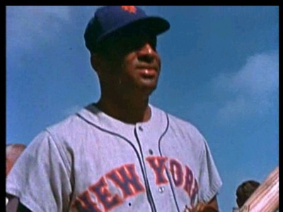
Why not use the upcoming 50th anniversary to offer retro jerseys? Actual retro style jerseys, not the fake creams with dropshadow.
A nice pinstriped white jersey. No black. No black dropshadow. Like Casey wore.
Pair that up with a nice dark blue (Fred, that’s Brooklyn Dodger blue btw) cap with a blue button on top.
Offer a nice new road jersey in a similar scheme.
Put a nice patch on the sleeve.
And…if black sells, except for the pesky part where it isn’t selling, you can still sell black! Under the terms of the Treaty of Flushing you can wear black every Friday, and you can even have “Anything Goes” Sunday where the team wears whatever you can dream of.
Imagine….tradition AND products to sell. A brand. An identity. Seems to work just fine uptown.
You tell me which of the following pictures looks stupid?

Come on guys…take a look. Fred, how can you say no to Dodger Blue?
The problem is not only that black, for the Mets, isn’t selling. It is that blue also is not selling. In point of fact, Mets gear is not exactly flying off the shelves except for the die-hard fanbase. Perhaps black is actually the better seller of the Mets stuff. Perhaps not. I would love to see the facts and figures. But should the Mets get back to being a winner in New York, it will not matter if their uniforms are neon green plaid their gear will be selling to all the folks jumping onto the bandwagon.
Not only get rid of the black uniforms, but also get rid of the black hats and the black and blue hats. The Mets don’t need to prostitute their history for the sake of the almighty dollar, regardless of the financial woes of the ownership. As stated many times, put a winner on the field, and the merchandise will fly off the shelves.
But, historically, black was both a color of the NY Giants and has also been an official Mets color for 1/3 of their existence (since 1998). In actual fact, going back to only orange & blue would be for many newer fans (e.g. those ages 20 years old and younger)getting rid of a color they have always known to represent the Mets. It would be kind of like the experience a fan may have had growing up a Giants fan who may have been 5 years old in 1935 when they had black & orange uniforms. The next year they changed colors to blue & white, then in 1940 added red to the color scheme. When they changed back to black & orange in 1947, someone who had seen the team in blue & white (and for the past six years red too)may well have thought that the team he had cheered for all those years was no longer the one he loved. Where was the blue? Hate the black?
At least the Mets merely rectified an oversight in their 1962 color scheme by adding a color which should have originally been there. Over the years many, if not the majority of, teams have totally changed their team colors. It is only in the latter 20th and early 21st Centuries that we see teams adopting unchanging colors (and not always then either, see Diamondbacks 2001 vs 2011; White Sox 1989 vs 1993; Athletics 1950 vs 1963; Padres 1973 vs 2011, etc.).
Michael, the Giants angle is a pile of bunk. The Mets started slapping black on everything in the late ’90s because it was trendy and a cheap (in the figurative sense) way to boost sales. The Royals, As, and other teams that couldn’t even manufacture lame & transparent historical reasoning all did the same thing. IIRC, even the Mets own press releases when it happened admitted the Giants only wore black jerseys for one season. The difference is the other teams all got over it and left the Black Plague behind with other baseball uniform fads like pullovers, beltless waistbands, and caps with white front panels.
The point that it’s already been a part of the scheme for a third of the team’s history is all the MORE reason to make the change ASAP. It’s gone on too long already. Running your team out in half-black caps is the uniform equivalent of playing Hanson songs between innings.
Keep the black alts. Call them a salute to the NY Giants and have it be…well, and ALTERNATE. But ditch the black in every other form where it’s so obviously forced just for the sake of having it there.
And again, if your’re going to be consistent, where’s the love for the Dodger’s red numbers?
I’ve no problem with adding the red for the Dodgers numbers (which also could be adding for the 1940-46 Giants). However, I think that the orange is too close in color for the red to be adopted and don’t see how it would fit into any uniform scheme with the other three colors.
Im 22 years old and LOVE the traditional White Pinstripes, Grey New York and Blue cap WITHOUT THE BLACK. The only way the Dodger and Giants should be honored is how it was originally intended, blue and orange. We’re the NEW YORK METS not the Brooklyn Giants. By the way, Blue White and Orange also happens to be the colors of the New York City flag. The black thing was cool in the 90’s (yes I had the two tier cap as a kid) but I wear my blue cap and pin stripes proudly now!
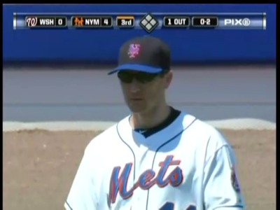
I swear, the Fredenstein unis (as in the Bay pic above) get uglier by the hour. Black-on-white-with-blue-on-black. It’s like somebody purposely set out to make the uniform as disjointed as possible.
Blue and orange. Pinstripes at home and traditional road grays. It’s so simple and classy that, only our ownership could screw it up.
hahaha… i was a 20something in 1998 and the black Mets jersey I got back then is hanging in my closet.
You can take or leave the black, but when the Giants return from their fifty plus year western road trip, I’ll drop the Mets in a heartbeat.
how awesome would that be of they came back?