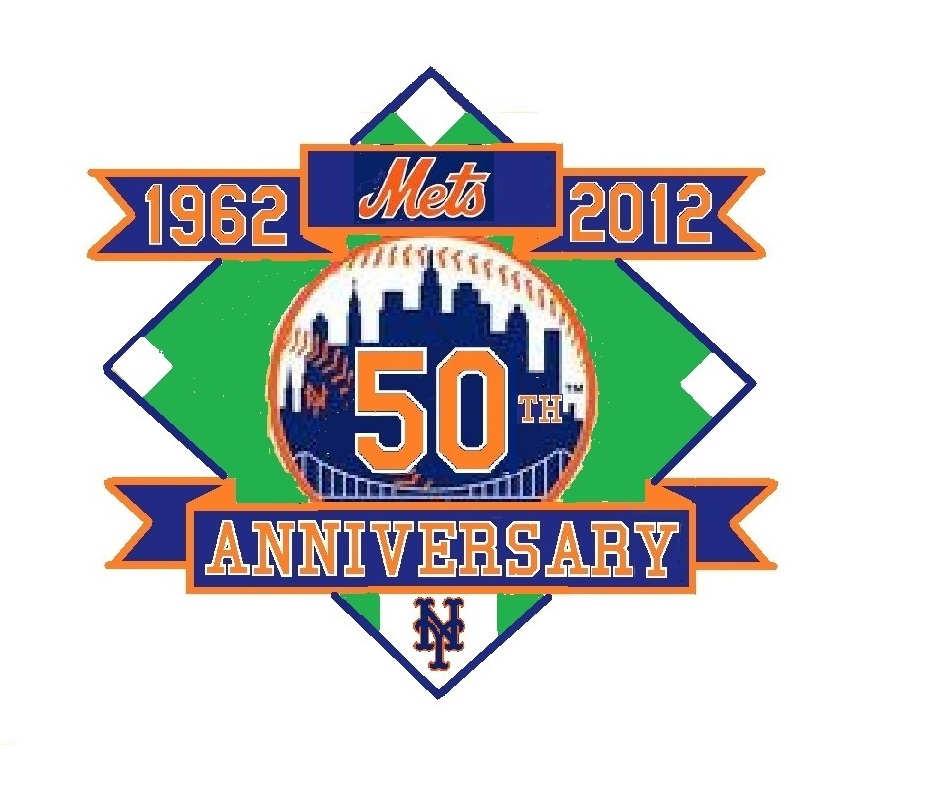
Whatcha think? Steve D would like the Mets to adopt this as their patch next year.
..
We could have an interesting run of patches and variant jerseys. 2013 could see an All Star patch. 14 has nothing obvious (no more Shea anniversaries).
What Mets fans talk about when not talking about the actual games.

Comments are closed.
It would either be to big to be worn, or has to much detail if made small enough to not look like a big piece of crap on a sleeve, so, it would just be a small indistinguishable piece of crap
It is no bigger and has no more detail than this
http://www.sportslogos.net/logo.php?id=1224
Sorry, but if the diamonds are roughly the same size, than the “ball” would be roughly 50% the size as in the ’86 patch. The bridge would be hardly noticeable, the building would be one blue blob, the orange NY would be a spot, the “th” by the 50 would be a horrific mess trying have the white border around the orange. The same goes for the blue/orange outlined NY on home plate.
Just because you can do it with MS paint, doesn’t mean they can stitch it. They can’t produce a “Mets” patch with decent appearing orange stitching now. How could you possible expect them to accomplish all of your depicted detail?
Not crazy about the green field. The blue is too dark – should make it the blue of the recent Los Mets jersey. The orange isn’t bright either. Maybe it’s my monitor? The interlocking NY almost looks black!!!
I actually have made versions that are blue or gold (for golden anniversary) instead of green. Personally I like the gold, as it would go with any uniform. Many teams in the past have used green, as it simulates a baseball diamond…
http://www.queenstribune.com/glossy/0308shea/Images/Page%2047%20(More)%20Uniforms%20over%20the%20years%20-%20Photos%20by%20Michael%20Cesarano/40th%20Anniversary%20of%20the%20New%20York%20Mets.jpg
That is easy to change. The shade of blue and orange are easily correctable. I see this as a concept that a professional graphic designer could clean up and tweak.
it looks too much like the 25th Anniversary patch
Nice try but unoriginal. Looks like the 25th and the 40th patch had a kid. Props to Steve for gettin the ball rolling on patch concepts. Id like to see what ‘Goon comes up with…
Terence M.K.
You’ll find that 90% of baseball anniversary patches are about the same…a big number…some form of the team logo…and banner shapes that hold some words. The patch shapes are usually cicles or diamonds. So I agree, its not too original, but it is traditional. It’s not as novel as say a dominos pizza logo.
The novel parts of it are putting the 50 into the ball logo and using the number font the team wears on the field and letter font that used to appear on the back of the jackets that the team wore in the 80s and 90s. There is nothing there does does not speak of the Mets.
gotta agree about the green, doesn’t do anything for me, would like to see somethng a little more up to date. to bad no way to integrate the 3 ballparks into it but that would be hard on a patch
Can you stick a 69 & 86 on first base and third base?
I thought of that…we’re not the NY AL team, but we do have two championships since 1962…that may seem paltry, but only 6 teams have more
Yankees 8
Dodgers 4
Cardinals 4
A’s 4
Reds 3
Orioles 3
The players should just wear a black arm band to signify 50 years without a no-hitter.
There will be black instead of blue and green, knowing these tone-deaf Mets guys.
Here’s the blue version
http://www.flickr.com/photos/66054817@N04/6036203765/
Based on the 40th ANniversary patch I think the main problem I have with the green in yours is that it is too bright. I didn’t like it at first but the blue one is just way too blue and you lose the sense of the baseball diamond. A darker green like the 40th anniversary would be fine I think.
Thank’s Dustin…the darker green looks better
http://www.flickr.com/photos/66054817@N04/6038677148/
I still ask why the Mets didn’t celebrate this as their 50th. 1986 was their 25th, as it was their 25th season on the field. This year was the 25th anniversary of the 25th year team. Last time I checked, 25+25=50.
The Astros (aka Colt 45’s) are giving away their 50th anniversary promotional hats next month to close out their 50th season, any they also started in 1962.
There seems to be inconsistency in baseball…some teams elect to celebrate 50th season…some 50th anniversary of beginning play. There is no right or wrong. However a team should be consistent in what they do. The Mets celebrated their 25th season in 1986, but erroneously called it the 25th anniversary at the time. They celebrated the 40th anniversary correctly in 2002, so they are going to be consistent now and do the 50th anniversary in 2012.
Just my 2 cents…I would celebrate the franchise by SEASON, not anniversary. So I would celebrate the 50th season. For events, like opening a stadium, or a championship team, I would use anniversary, for example this would be the 25th anniversary of the 1986 Mets. That is just personal preference.
i just want to see a celebration next year with as many living players as possible to show up and wear the patch. !