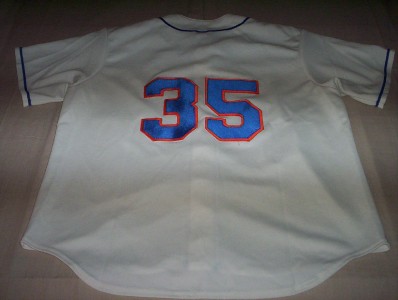
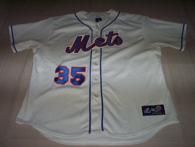
Let’s play the last round for 2011 of,”What is wrong with this jersey?
This was on Ebay today.
VINTAGE NEW YORK METS STITCHED MAJESTIC BASEBALL JERSEY #35, MENS XXL
CHECK OUT THIS AWESOME NEW YORK METS JERSEY, WITH STITCHED ON LETTERING AND NUMBERS!!
MATERIAL: 100% POLYESTER
BRAND: MAJESTIC
SIZE: XXL–PLEASE CHECK MEASUREMENTS
CONDITION: GREAT
CHEST:(ONE SIDE) 28″
LENGTH: 33″


1. Numbers are the wrong font…Mets have always used block standard at home. The 5 actually looks like a flipped over 2.
2. Front number is on wrong side of jersey
3. Since the script has drop shadows, so should the numbers
4. There should be a name on back
5. Hard to tell from photo, but looks like script has an extra white outline that is not standard
6. Sleeve patch is missing
Here is what happens if you flip that 5 over
Its not a flipped over 2. you would have to do two photo manipulations to do that. If you flipped it in real life you would get the backing of the 5 to look like a number 2.
Its a replica jersey the white outline on the script is part of the replica pin less jerseys…Also no patch because it is a replica.
Almost everything
The #35 is on the wrong side of the front.
Whoa…seriously? Let’s see… White outline on script, no black shadow on numerals, and… hmm, there’s something else wrong, but I can’t quite put my finger on it… let’s see…. mmmmmmm…. Oh! Yea! No skyline patch on the sleeve!!!
Wait, there’s something else…. I’m sure of it… hold on…. yes!! The numerals are the wrong font!!!
Let’s see… what else… There’s no name on the back, but it could be a Rick Reed jersey from 1999.
So I guess that’s it.
(Oh…. and did I mention the front numeral is on the wrong side?)
no patch because it is a replica.