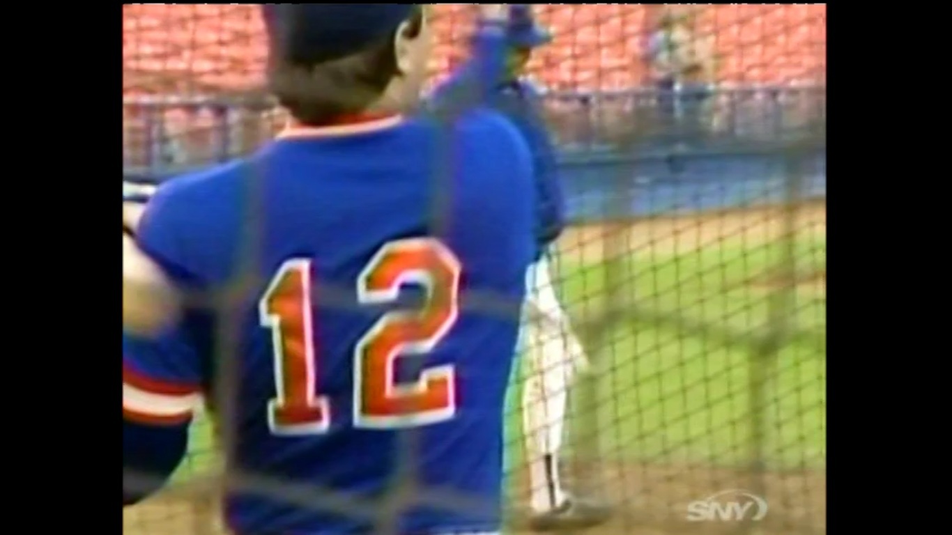
Pulled this from the 50 Greatest Mets special. I don’t recall this font on the blues.
So I emailed Supreme Commander Lukas over at Uni Watch and he told me to take a look at the jersey inconsistencies on this page. Wow.
What Mets fans talk about when not talking about the actual games.

Pulled this from the 50 Greatest Mets special. I don’t recall this font on the blues.
So I emailed Supreme Commander Lukas over at Uni Watch and he told me to take a look at the jersey inconsistencies on this page. Wow.
Comments are closed.
Shannon,
The Mets first wore blue BP jerseys in 1981. The font used was the one you see in the picture…BLOCK WITH SERIF. This is different than the font we know and love, that the Mets have used at home every one of their 51 seasons, which is BLOCK STANDARD. Actually they are similar…the numbers 0, 3, 5, 6, 8 and 9 don’t have serifs in any font and look pretty much the same…the 1, 2, 4 and 7 have the serifs. This was used in 1981-1983. In 1984, the mets went to a mesh BP and switched to the familiar BLOCK STANDARD. The one exception to this rule? None other than The Franchise…while every teamate wore the serif font in 1983, he wore the familiar one (I can seend a pic later to show this).
Steve, I am not saying this to be a wise guy or anything but did you click the link above where it tells you when the BP Jerseys were first used(basically saying the same exact thing you just commented with pictures) ? The pic of Seaver’s jersey will be useful though
MG,
Thanks for your input. I am very familiar with that link…it is from Bill Henderson’s guide, 5th edition. It doesn’t correctly name the fonts and years like I did. In fact, changes are being made for the 6th edition, largely based on my input. It is going to come out shortly and Bill sent me his draft for my review. He knows a lot about uniforms from every team, but he needs to rely on local people on some minor details sometimes, such as arcane BP fonts. Here is the picture…I scanned it from the 1983 yearbook and had emailed it to Bill.
http://www.flickr.com/photos/66054817@N04/7224180360/