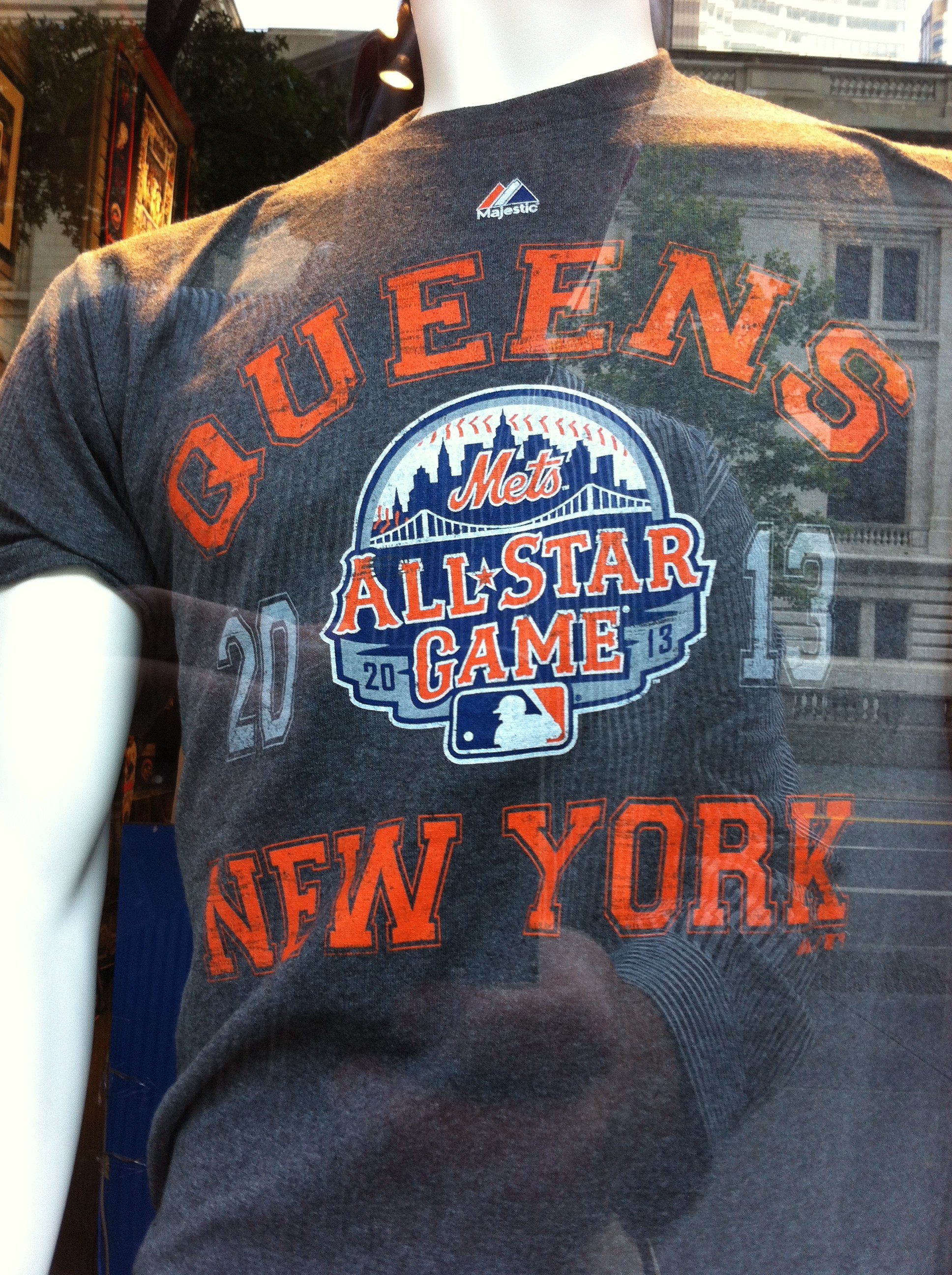
I’m really trying @Mets but Eric says he saw this in the clubhouse store on 42nd street this morning. I guess it could be a photoshop…Eric can be rascally like that. I like how he photshopped in a mirror image reflection of the NY Public Library across the street. Well done.

UPDATES:
The Mets are holding a press conference on Tuesday at 3pm (like my daydream) to “unveil the official logo of the 2013 All-Star Game.” Cool, I look forward to seeing what it looks like.
Some smarter-than-me folks are speculating on twitter that the above is the secondary logo. Seems Primary ASG logs don’t have the team name. Take a look at the 2012 logos, one that says Royals and one that says MLB.
UPDATE 1PM: Civilians telling me the shirt is no longer in the store window.
…
If you’re a new reader why not subscribe to the free weekly newsletter? Just enter your email address below.
Sure looks like the assembled signage you posted yesterday. The font is strange, looks a bit like a mix of the “New York” road font (for the 1st A, and the G, and then something else) a bit of an MLB fail if you ask me.
here’s my speculation: mets will unveil this version of the logo, with mets script, on tuesday. that will be used primarily in team-centric marketing and special merchandise sold in the team stores. then, 2013 will see the quiet integration of what will eventually become the “primary” version, which won’t have the mets script (but be practically the exact same thing). and that will be what’s on the mets’ jerseys and the BP and all star game jerseys.
also, walt brings up a solid point about the font. looks more pirates-inspired than the mets’ road font. which surprises me. but overall, the feel they were going for was the one the got. very solid logo, IMO.
I agree, overall I like the logo. But, disappointed by the font used. It just looks weird. On closer look the A in All, the S in Star, and the G in Game seem be a tuscon inspired font, similar to the Mets road font, but none of the other letters match.
Gives me the feeling the went with tuscon font, didn’t really like it, but wanted to some how squeeze the feel in.