
Not sure when this happened but @dgwhitman put this on my radar (THANKS!)
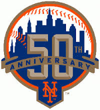
Let’s take a look at the skyline logo from the 50th anniversary first…
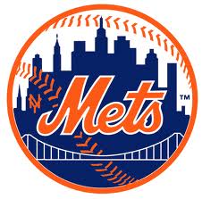
And let’s take a look at this one
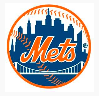
and let’s take a look at the logo being used by @mets this evening.
Now look at that building on the right. That sure looks like the Citicorp building Citigroup Center 602 Lexington Avenue to me.
Did the Mets whore out their logo for a corporate sponsor? Did the Mets randomly pick a building to swap in that once had Citi in the name? Weird.
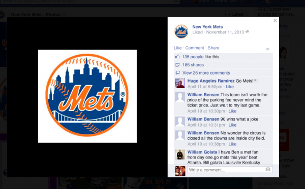
UPDATE: it looks like Mets Facebook used this logo on 11-11-13. None of us noticed. However my 2014 tickets have the “old” logo, Mets.com has the old logo and emails from Mets staffers have the old logo as recently as today.
That logo looks like it was doctored at some point. The part that
looks like the Citi Group building was cut out from what was the UN
building. In all other places except for the Mets Facebook, Twitter, and
Google Plus; the logo used would be 1999 logo with the building flat
top. One other thing, if the Mets did alter their logo, they would have
to get permission from MLB’s offices first before changing it. The
turnaround can be at least a year to two years before a team changes
logo due to giving notice to all the vendors (business), press,
outfitters and the like before the change. Looking at the Mets
“Facebook” logo, personally don’t think that MLB would even allow that
change as it would be too obvious of a connection with the Mets and one
of their sponsors (Citigroup). At no point on the Mets official website,
nor their primary uniforms, nor the many memorabilia items for sale
have the “Citigroup” building inspired logo.
In
closing, I have the feeling that Mets graphic designers, instead of of
using their own logo files that they have on hand from MLB; basically their style guide (think of it as the Mets logo bible),
just lifted the logo from the internet (perhaps Google Image Search)
and placed it on their social pages. The result, as expected adds a few
questions to some, by in my opinion shows that Mets (as usual lately)
did a sloppy job using that logo instead of the one on their style guide. I really think we should let them (The Mets,MLB) know about this, although I get the feeling they have bigger fish to fry.
Sean Caruana Are you implying the Mets have employees so clueless, they don’t know their own logo?
The Twitter logo has been restored to the correct building…the Facebook logo is now a white surrender flag.
At best this may have been a lower level employee joking around with our hallowed logo and risking all kinds of trademark and copyright problems.