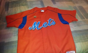
@toninom was sticking up for the orange jerseys last night and was mad/surprised I don’t have one. I was out of work that year…no orange jersey for me.
I like orange Mets-wear even though it looks terrible on me. I do have a burnt orange Wright.
I dislike the underarm stuff on all BP jerseys and also NFL jerseys.
Speaking of jerseys, since today is Saturday (so says my tickets) I am going to rock the Undefeated Mazzilli jersey tonight at Citi. If you see a fat guy in a Mazzilli jersey it’s me.
Actually if you see ANYONE EVER in a Mazzilli jersey it’s either me or Lee Mazzilli, and you’ll know it’s Lee because you’re at Old Timers’ Day.


I have the orange jersey it’s real and it’s spectacular
This could’ve worked if not for MLB mandated armpit, side & shoulder panels. The dropshadow doesn’t help. A simple, shadowless blue letter-white trim or white letter-blue trim, with some traditional road jersey blue piping & this jersey is a winner.
i agree..the underarm stuff ruins all jerseys. BP, All Stars, orange, blue, NFL
Nah!….Orange doesn’t work for me and the Mets!
SWEEP THE FISH!
As usual, we agree.
Man that M is facing downwards…what is the marketing reason behind that again?
Obviously to annoy the likes of you
It annoys me, but I’m sure eventually some level-headed person will fix it. Arguing about colors is subjective, but this clearly violates proper penmanship.