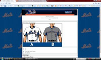
 Now that we’ve seen the survey that the Mets have issued, I think we can make a few assumptions.
1. I think the black uniform era is almost over. Why have the survey unless you’re thinking of changing things?
2. Expect to see a new previously never seen uniform in 2010. As I wrote here an important part of this is the merchandising. If you’ve sold everyone a black Mets jersey, why not sell them a new look like the one on the left? I had some ideas which you can look at. The Mets won’t just go pinstripes and classic-road jerseys. If the black disappears it will be replaced by something else.
3. Expect the snow white to continue to be the dominant jersey. Reading the survey you notice the “snow white” jersey look, and pinstripe-less variants are much more apparent than the pinstriped variety. There are many battles to fight, and I will surrender on pinstripes if it means that black leaves.
4. The Mets are reading the blogs. Maybe it’s not this blog, but the they are reading somebody’s. The questions asked seemed specifically about the black uniforms. That’s not a newspaper column topic or even a WFAN topic. That’s sites like this and Uni Watch and whoever else I am forgetting. It’s also folks like you who post comments on all the boards and blogs, proving to the Mets this is more than the opinion of one fat guy with a lap top. The question about the bridge is also a bloggers topic.
At the end of the day I am thrilled that they did this survey. It shows that they actually care what the fans think, and actually pay attention to what we say. Now you guys might all vote for black uniforms and calling the bridge Amazin’ Alley, and that’s if what everyone decides, I’m fine with it – because it will be the fans who decided, not some yahoos in marketing.
Well done Mets!
I’d be curious to know how everyone else voted, or would vote if they had received the survey. Click comments because after all, it looks like they are reading the Mets Police after all.
www.metspolice.com
@metspolice
I just heard about the Mets survey on uniforms. I don’t know if it’s too late to participate, but if you could add my thoughts to their survey, I would be grateful. As a long-time Mets fan, I’ve found the black uniforms so distasteful that it was hard for me to watch. Black may be fine for the Raiders and marketers, but please keep them off the Mets! I’m a bit of a traditionalist when it comes to these things – the home pin strips and road grays with old fashioned lettering – were what I grew up with and enjoyed the best. The Yankees do some things quite well – one is that they remember their traditions and honor them. One of those traditions is their uniform – home and away – you can always count on it
David Shaman
I think you’re doing a great job bringing to light over a decade of horrendous Met uniforms. The black uni’s, shadowing, needs to go period! In my opinion, they should wear the pinstripe uni’s at home (Tom Seaver model) and road greys with block NEW YORK writing like in 1988. (Dwight Gooden model). The hat always blue w/orange NY, and last but not least, get rid of the orange beanie on top of the hat. Makes it look like a clown hat. It works with the NY Giants hat, but Mets always had the solid blue hat… The orange beanie on the hat is a huge marketing faux pas that your site missed. They should also honor the 86 Mets with the Race stripes from time to time. If they want to sell merchandise, people want the vintage stuff, not the uniforms they pedal at Walmart. I remember when Mets honored the 86 Mets and wore the 86 uni’s, all the announcers were saying how they looked so much better than today’s uni’s.
They could update the ’86 pinstripe with some modern proportions, bring it into the 21st century, and not make it a pullover. Also, I agree on bringing back the blue hats and pinstripes permanently, but bring back the old blue, which was much richer and not so bright and ridiculous looking.
i've been a fan since around 1967 and i STILL like the classic look of the old unis.
i also managed to vote in the survey.
i HATE the black jerseys and the all black hats.
UNlike a lot of you however, i don't mind the black drop shadows on the current jerseys and i kinda LIKE the the blue/black caps (as an alternate)
the 'concept' unis in the survey were mostly small variations of the current sets, but that one page with the 'way out' concepts looked more like intramural softball unis rather than professional baseball unis.
while i'm happy that they conducted the survey, two questions remain.
1- will they publish the results?
2- WILL they actually listen to the fans or just do whatever they want anyway???
david f
hahaha they never said the 86 uni's were better..they thought they were gross..get your facts moron…,i rather have black than those 86'ers….what!!! block lettering..geez must be a yanker fan…only classic ole english lettering,ty.