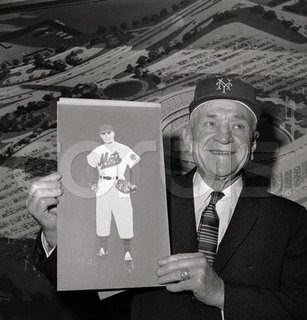
Yesterday we talked about Casey Stengel’s original design for Mets uniforms.
I asked the question if it made the early 90’s “swoosh” jerseys more palatable…but I couldn’t quite remember the year and didn’t have a picture….
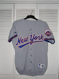
“So does that make the underline Mets jersey they wore for one year in the 90’s (can’t find a picture right now, someone send it to me) less of an abomination?”
No.
Here’s the home jersey modeled by the quintessential Met of 1993, Anthony Young:
The underlining swoop alone was bad enough, but if you look closely, they also distorted the “M” somewhat. It looks a mile away from the “ets” when compared to the usual design.
These are pretty awful aren’t they?
Main Mets Police page
Follow us on twitter @metspolice
Facebook page
send ideas/guest columns to shannon at metspolice.com


