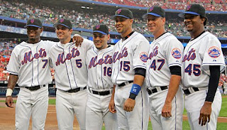
UPDATED AGAIN:
From UniWatch:
The 2010 Mets uni info buried in the middle of this report is accurate. The related but slightly different report that ran in yesterday’s N.Y. Post is NOT accurate.
Uniwatch is as good a source as we’ll get. So, what does everyone think?
EVEN MORE UPDATED: Paul from Uniwatch was quick to respond to an email about “black”. The “retros” do indeed have the drop shadow black. Now we can call the Mets idiots all day.
Below is what I had posted earlier this morning, some of which is now irrelavant.
______________________________________________________
From what I am gathering from what Rubin says in today’s News and what Hubbuch said yesterday (scroll
down the site), the Mets home uniforms for 2010 will be:
Primary: white no pinstripes. The ones they wore most of the time
this season.
Alternate: an off-white pinstriped version like what was worn by the
1969 Mets at the celebration.
No word yet on how much black if any. (as I wrote in the update – the retros have black. The roads will be the same)
My take: I like how the retros looked. I’m happy. Will be happier if
the black leaves. (it isn’t). I prefer the pinstripes to the no-pins but I have
warmed up to the no-pins especially on civilians.
Stay tuned…
UPDATED:
Here is what Rubin said:
The Mets plan to go retro with their pinstriped home uniforms next season. Those uniforms will change to off-white, as they were in the 1960s, from their current bright white. That will also serve to differentiate the pinstriped uniforms from the solid home uniforms, which will remain the brighter white.
Read more: in the News
The debate now becomes is whether or not the uniforms were actually off-white in the 1960’s.
This is what the 2009 Giants are wearing…looks creamier than the above.
This is from 2007….the “snow white”


I have no problem with the white primary uni, AS LONG as they don't wear those ^%$#ing black hats with the blue bills and the black undershirts…funny how they didn't think blue and orange "was tacky" when they designed tjhose Creamsicle BP unis a few years ago…
Cream-colored retros? Yeah, more manufactured history…too bad the the Mets never wore (*&^ing cream uniforms…
The original Mets home uniforms were white with blue pinstripes.
The snow white uniforms with the blue piping is supposedly an homage to the team's Dodger heritage. If one buys into that argument, then surely the use of cream colored uniforms at home would be an homage to the team's Giants heritage, right?
The big thing is that those who complain that the Mets honor the Dodgers to the exclusion of the Giants can't really make too much noise about a cream colored home uniform…
The Mets need to stop trying to reinvent the wheel. Their original uni was designed to pay homage to the 2 teams that left. It was done the right way in '62 and should be the only uni they wear (white w/ pins & blue caps at home and gray with blue caps on the road). Simplicity is lost on the Mets front office.
Basically this ( http://farm4.static.flickr.com/3435/3966079908_a27e095d49_o.jpg ) is what you can expect for 2010. It’s also not the primary uni for next year, but will be relegated to “alt†status. Nice job, Fred & Jeff.
If they're going with their 60s style pinstripes, does that mean they'll also be wearing the cap with the blue button on top?
Enough- freakin enough- Its another reason why the Yankees know their "class and tradition" and we just run with new styles every 5 years!
Just go back and replicate the 1969 colors (darker blue) and styles and leave it at that.
The original uniforms were, in fact, white, but the color of the white was more of an ivory because the wool uniforms weren't able to be as true white as the polyester uniforms were. So, yes it was white, but this white is actually closer to the originals. Look at the mitchell and ness 1969 jerseys. that was what the original jerseys looks like.