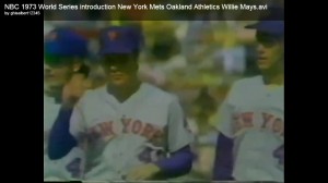
The other day On The Black posted a cool video of the intros from the 1973 World Series.
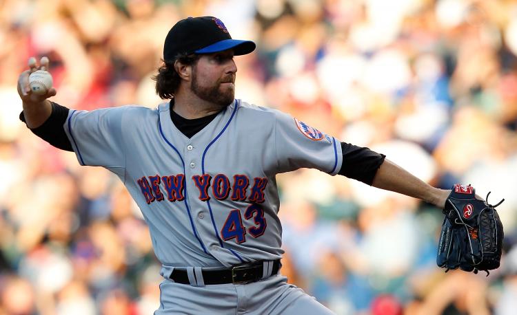
I did this screen cap. I defy anyone to tell me that this road uniform does not look better than the 2010 version did. LOSE THE DROPSHADOW IT LOOKS TERRIBLE.
Click on the picture for a bigger version. This was the pinnacle of Mets road uniforms.
I defy you.
Even with crappy resolution you can more easily read the New York on Tom’s jersey than RA’s.
Jeff, gangs aren’t wearing Mets jerseys. It’s over. You gave it a try. You can sell all the black bastardized stuff you want in the Mets store. You’ve hired professionals to run the organization. Now have the players look like a professional baseball team.


couldn’t agree more.
Sorry dude, but black is one of the official colors. If you can see the “New York” better on Seaver, it is only because the picture is shot in brighter light. Although I don’t think that black dropshadowing either adds or detracts from the lettering, it is an official color and there is really no need to eliminate it.
Michael. Check out this link which was on Mets.com in 2009. I don’t see a link to it on the current site, but the old URL is active. Read the 1961 section:
The Mets’ colors are Dodger blue and Giant orange, symbolic of the return of National League baseball to New York after the Dodgers and Giants moved to California. Blue and Orange are also the official colors of New York State.
That’s the wording on the official site. If you can show me somewhere where black is official I will be happy to post it (and complain about it).
Besides, you didn’t say dropshadow looks better. I dared you. 😉
Ah, but according to the MLB Style Guide (page 30), the Mets added black as an official team color in 1998. They then added the black alt jersey, but didn’t add the “Midnight Skyline” patch until the 1999 season – http://www.mlbstyleguides.com/images/src/index.html
Oh, and I don’t think the black makes much of a difference one way or the other. It isn’t better with the dropshadow, nor is it worse.
michael, i was waiting for your “black is a team color” comment. it’s like clockwork. as are my “i hate the black uniforms” comments.
the thing is: just because the team officially uses it as a team color now doesn’t mean a) they should and b) that it should be a part of EVERY ELEMENT OF THE UNIFORM.
write a word on a piece of paper. now outline it. now outline it again. does it make the word you wrote look more or less legible. the idea that the black has no effect isn’t true. it does. or else it would be…well…invisible.
it’s poor design. and again, like i told the mets marketing people on the phone a year ago: traditionalists understand alternate jerseys. we know where the black came from. i don’t have to like it, but if you want to feed me the “it sells, so we keep it” line, i would argue that, but can at least understand the thinking behind such a sentiment. but what makes most fans resentful is that the black infringes upon every element of the uniform. including a THROWBACK uniform. which is so incredibly foolish i can’t even begin to express it. ditching the dropshadow would make such an immediate improvement on the exisiting uniforms, it wouldn’t even be funny.
“the thing is: just because the team officially uses it as a team color now doesn’t mean a) they should and b) that it should be a part of EVERY ELEMENT OF THE UNIFORM.”
Brian, true that you and I seem to repeat ourselves re black. The fact is some folks like it and some don’t. Regarding #a above, I believe that black should always have been a color (further including the Giants colors to go with the white and blue of the Dodgers) but the team belatedly adopted it a score of years ago.
While I do believe that retro jerseys shouldn’t deviate from what once was (this would mean, of course that these shouldn’t have NOB and also wouldn’t be allowed to be made “Cool Base” since the armpit area is a solid color rather than the pins), since I still believe that the addition of black is a rectification then it should be included. To see how a team should do a retro, one need only look at the alt jersey the Twins had this year.
Regarding #b above, I’m pretty sure that there is no black in the trousers of the pins, roads or Snow Whites. 🙂
thank you thank you MP – the shadow muddles the look – just get rid of it already – PLEASE PLEASE PLEASE. i will accept a home one a week black thing, just lose the drop shadow. it is ruining a classic style.
BANISH THE BLACK!
well, “better” is subjective isn’t it?
I’m still waiting for all orange with blue pinstripe jerseys.
When you compare both pics, the older version, IMO looks cleaner, and it could be because there is greater use of the color blue in the older version… look at the caps and look at the under t-shirt; the mixing of black is the biggest contrast. I think the blue works better, or is a better match.
Unfortunately, 1973 was the last year of that awesome uniform until it was brought back in 1995. I was a bit disappointed in 1995 that they did not match the old varsity numbers (they went with the home block numbers) but I got over it and bought one. I was in pure horror when they added the vile dropshadow to it in 98.
Someday the black will disappear…and someday they will fix the Mets script back to the way it was before the M started to be out of alignment with the rest of the logo (this is called the Wilpon Script by UniWatch). It must have been designed by a monkey. If I ran the Mets. I would restore the uniforms, jackets, hats and logos to 1969-1973 vintage immediately. I would probably add a blue alternate for fun.
The problem isn’t even that the dropshadow is black. Simply having a dark color beyond the orange outline makes the lettering look smudged. Even if the shadow was blue, it’d still look like crap.
Oddly, even though it’s the worst match historically, aesthetically, I think the dropshadow actually looks best (notice I didn’t say “good”) on the pins. Having that extra added bit of separation between the script and the pinstripes makes a little more visual sense than completely unnecessarily trying to “highlight” lettering that’s on a plain white or grey background to begin with.
Bring back the ’93 Tail.
When they dropped the tail, which was added by a complete moron, the uniform looked almost perfect until they added the black. They did have a useless white border around the numbers that took away from the orannge border. I guess they can’t help tinkering with the original designs.
I get the feeling that they put the wrong person at the controls. Mindnumbing permutations. Coming next: the tripe outline plus black dropshadow and swoosh underline on the front, with a hologrammed Mr Met on the sleeve.
I just wish that, for the team’s 50th season, they’d actually wear the same jerseys that were worn in 1962.
I own a classic (mid-90’s edition) road jersey that I absolutely love. I also have a Dallas Green era (w/ swoosh) home jersey that I loved when I bought it, then disliked it, and now have a soft spot for it.
Mr. Wilpon, please get rid of the black trim. Thousands of Mets fans will thank you!
Cheers!
-Doug
To me, anyone that likes the black can’t be a real Mets fan! There I said it! There is absolutely no doubt that both home and away Mets uniforms look 100% better WITHOUT the lame black shadows.
The clean orange against white or grey is so much better. When you add the black you get that strange “purple” effect.
I really hope ALL black will be gone soon.
the reason for the black uniform and jackets.
THEY SELL THEM AND MAKE MONEY!
also get rid of the home jersey without the pin stripes. they look like pajamas!