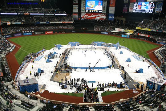
Anyone watch the Winter Classic last night? I tried but unless it is teams I care about it’s really hard to get me to stick around. I really hope we get one at Citi Field even though politically (ratings) it would make sense for it to be something like Flyers-Rangers (and I hate the Rangers.) I guess I could sit there and root against Media Goon (who made this image) for three hours, I have done it before.
Puck Daddy wrote about the game and brought this up…cough, Fred/Jeff, cough…
Retro jerseys = sales. Remember when the Capitals unveiled their Winter Classic jerseys and fans were like, “That’s nice, but I already own that one.” Then the Penguins released theirs and everyone was like, “Really? Blue? Again? And what’s up with all those stripes?” Well, despite the ho-hum attitudes towards both jerseys, they’ve been a hot seller. According to the NHL, over 38,000 jerseys have been sold and it’s been proven as you walk along every street and look inside every restaurant around Heinz Field.
No, the Wilpons wouldn’t make money off hockey jerseys, but they do make money off Mets jerseys. If retro=sales, then why not ditch the black? Then black can be the retro for Generation Piazza and the actual baseball team can look less like a softball team or Los Angeles gang.
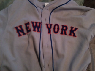
Some of you are saying they already have the cream colored jersey. But yes my friends, those have black dropshadow. Look at this gorgeous jersey…crisp, neat, traditional, blackless. Wouldn’t you like one with say a 5 on the back (and no name) and a 50th anniversary patch on the sleeve?


I’m all for not having NOB on the home jerseys. I think every MLB should be like the Giants in that regard (i.e. numbers only on home jerseys and number with name for the road ones). Fans of the home team should know which players are what numbers, but it is a bit much to expect folks who cheer the home road team to know who is whom (I know I don’t know who some of the subs are for, say, the Brewers or Rockies).
As my wife says, the classics never die.
Just to be clear, you don;t speak for everyone when campaigning to eliminate the black from Mets jersies … I like the black drop shadow.
I could care less if they eliminate the black alternate jersey, but I see no harm in keeping the black accents.
The pin-stripe home uniform should be the standard …. if anything, I would eliminate the “snow-white” uniform first and got with pin-stripe at home and road-gray …. a black alternate for either hoe or away is fine with me.
Ron, I agree with you regarding the keeping the black, but would rather they omit the pinstripes (which were adopted to honor the Yankees) than the “Snow Whites”.
I don’t think the Winter Classic will come to Queens. It’s clear the NHL wants Yankee Stadium, and they’ll wait, or the Meadowlands, which they can get next year. Otherwise, I think we’d have gotten one already. And nice job by Media Goon on the photoshopping, but I think they’d actually have the ice going 1st to 3rd. i wonder what the obstructed views would look like though.
Hate the snow whites…(once again, Dodgers not Mets) Hate the Black. And yes Ron, I am not sure that the Chief ever said he speaks for everyone. Mets colors are Blue & Orange, NOT black.
The problem with the drop shadows is that they weren’t just a stylistic tweak along the lines of adding the orange cap button. Nobody said, “You know, adding some shadowing would add some depth to the lettering and make it look better.” No, it was solely done to artificially force the white jerseys to “match” the black-crowned caps and black socks, neither of which should’ve ever been worn with the pins or snow whites in the first place. The dropshadow on the pins only came as a result of the preceding, dumb, on-the-fly decision to randomly wear the alternate cap with the non-alternate uniform. If you recall, the dropshadow was originally only on the snow whites, which were originally to be worn with the black-crowned caps, which in turn replaced the ice cream caps that were paired with the original shadowless snow whites.
As I’ve said before, I’m perfectly OK with the black jerseys and all-black caps as an alternate. I’m open to whatever they want to do as an alternate. I’m even down with Shannon’s “One Day a Week, Anything Goes” idea. It’s the mixing and matching and unnecessary screwing with the STANDARD look that has played out and needs to stop.
I have never seen it stated by any historian that Met pinstripes honor the Yankees. Many teams wear pinstripes. The original Met colors were blue and orange…that’s it. I don’t recall any black squares on the outside of Shea.
Adding black was done by several teams in the late 90s…Mets, Reds, Royals, A’s, Texas. There was no original thought by the Mets that black should be a team color…it was a hot trend to sell jerseys. Why it hasn’t been corrected yet is beyond me. Also, they must correct the way the wordmark looks like the M in Mets is falling into the other letters. That is known on Uniwatch as the “Wilpon script.” It looks like a printing snafu.
http://farm5.static.flickr.com/4001/4581176045_4836928790_o.png
I have read several places that say that the original Mets uniforms were designed to honor the Dodgers (the script for the Mets closely follows that for the Dodgers), Giants (the NY logo) and Yankees (pinstripes on home jerseys). Whether this is true or not, one cannot fail to acknowledge that when referring to pinstripes in a New York team it is most closely associated with the American League team (fairly or not). This is not to say they originated the pins, but that they merely are the most closely associated team with them.
Moreover, the design of the “Snow Whites” is original to the Mets alone without taking into incorporation of the Giants, Dodgers or Yankees.
Regarding the black, it should have been an official color to begin with. The blue and white of the Dodgers was already incorporated into the uniforms. The Paysons should have included the black with the orange to fully incorporate the colors of the teams for which they carry the legacy. The 1998 incorporation of black merely rectified this original oversight.
You are entiltled to your opinion…I think the Payson’s felt, as I do, that black and blue together look hideous on a uniform. Furthermore, the original blue and orange uniforms were beautiful. No need to change a thing. If I were in charge, I would recreate them to the letter…including the fact that the road numbers were varsity and home numbers were block. I would restore the original script wordmark, remove the orange cap button and put the NY back in the logo. The only difference would be names on the jersey, which I don’t find out of place.
But when was white ever considered a “team color” in the first place? I have never in my decades of following this team ever seen anyone reference the “orange and blue…and white” of the Mets. The only cases in which white is considered a team color is in the absence of a 2nd color (e.g. the Dodgers and Royals). The University of Michigan’s colors aren’t “maize and blue…and white” nor are the Green Bay Packers “green and gold…and white” even though both have white in their uniforms. EVERYBODY has white in their uniforms to some extent. It is the neutrality upon which team colors are used. If white is considered a team color, then doesn’t grey have to be, too, since it’s the base color of the road unis? For that matter, does it mean the Phillies, Twins, Braves, and a half-dozen others added “powder blue” as a team color in the late 70s and early 80s and should’ve never done away with it?
All that is to say: blue came from the Dodgers, and orange came from the Giants, thus one color came from each. Besides that, even if you insist on counting white as being from the Dodgers, the additional nod to the Giants’ cap logo still evens things out 2 tributes to 2.
Of all the teams that suddenly added black in some form to their ensemble in the mid- to late-90s, the Mets were the only ones dense enough to go so far as to call it an actual team color. THAT’S the mistake that needs to be fixed.
I never noticed the crooked M until it was pointed out somewhere (probably Uniwatch via here). Now that I know it’s there, I can’t “unsee it,” as the saying goes. At least the dropshadow has a purpose, albeit a silly one. There’s no good reason 1 letter should slant at a different angle that the other 3.
As long as a Dolan owns the Rangers, there will NEVER be a Winter Classic game at I’m Still Calling It Shea. Venue is too small. Sightlines such. Highlander Park is smallest venue they’ll play in. NHL will wait for the Bronx to open up [Dolans do get along with Steinbrenners, it’s that shared Cleveland blood] or New Meadowlands Stadium. Not with the Madoff Mets.
Great idea floated – Rangers as away team in Ann Arbor at Big House vs. Detroit Red Wings. They’ll get 100K in stands then.
good point – does Citi’s capacity hurt?