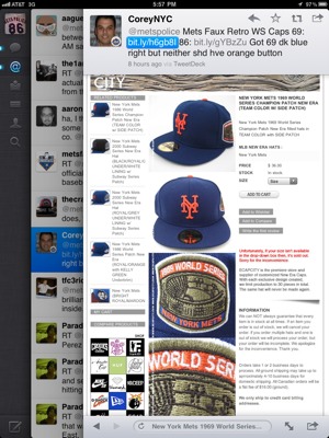
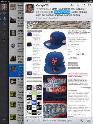
Here’s a new kind of post…i don’t even have to tell you who tweeted what! I think we’re getting pretty close to the blog becoming self-aware and writing itself. I’m pretty sure we’re getting to the James Bond phase where George Lazenby can talk over as Shannon.
Sloppy sloppy work on that button. Thanks to @coreynyc for the hookup. (His point is that neither the 69 nor the 86 cap should have an orange button. You knew that, right?)


It’s not just the orange button on top. The 86 faux cap is gray under the bill – should be green
WRONG, just look at Orosco reaching for the sky, it’s gray. http://bit.ly/huBPrd
Also, all of the retro WS caps have the damned orange button. I don’t get it
I stand corrected – I never realized that they went to a gray under bill in the WS. I distinctly remember a green under bill for regular season caps http://bapple2286.files.wordpress.com/2011/01/carter-87f-ss.jpg
That is correct…green during the season…gray for the WS.
I thought so too until I saw the pic the other day
That orange button is why I didn’t get the cap. I also wonder if the serifs are accurate or not, I think the older caps had serifs that didn’t indent inwards as hard…
i remember cap day at shea stadium 1965 or 1966 the mets NY logo was a swen on patch.
it was not ugly
it was u-gleee !
I’d love to see that cap.