Mike writes:
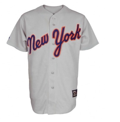
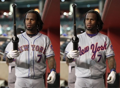
I’m really not a fan of the Mets current road uniforms, especially with all the BLACK and DROP SHADOWS! So I took an one of the old uniforms and photshopped it onto a new uniform design, what do you think?


I like what you did. However, I love love love the traditional road font. Some day the drop shadow will leave, I will post my picture of VJ day (VB Day?) and we can all get on to complaining about something else. Now about the black fence…
Never liked that script, fix the current jersey by removing the black & we’re in business.
I actually own a Seaver pullover version of this jersey. I love the script and the racing stripes on it but this photoshopped version looks sharp.
I like the idea of using this font again. The blue would need to be lightened as my jersey looks more navy blue as does the picture.
HATE that script! Mets currently have the best road jerseys in baseball (whether with or without dropshadow). Why tinker with perfection?
yeah i do think this looks good, but mostly because of the lack of black and the blue undershirt (and also, a great photoshop job!)
fix the current roadies and we’ll be good!
I never really liked that font. The lowercase-looking “N” ruins it. I wouldn’t mind seeing them going back to the 1993-’94 style, minus the underline, which is true to the font the team used during the franchise’s beginnings. The jerseys of course always used the Giants’ style, but this script is what was on pennants and other promotional materials:
http://catalog.greyflannelauctions.com/LotImages/32/4115A_med.jpeg
Mike, if want to give that a shot, I’d love to see it. My own photoshop skills are that progressed yet.
Sparks, I’ll check it out and see what I can work up
they are worse than the home jerseys without the pinstripes. they look like pajama tops for kids.
is that why over the past three years the mets play like they are sleeping?
future mets road jersey
how about gray with the mets “NY” on the front?
The Giants wore something similar during the late ’80s:
http://cdn3.iofferphoto.com/img/item/117/669/055/zciY.jpg
It looks nice & classy, but I’m nonetheless a firm believer that your team name should be on your home jersey and your city name should be on your road jersey.