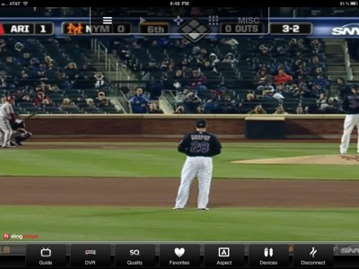
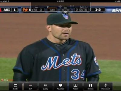
(Hello if you are visiting from today’s Uni Watch link. After reading this one, you may find my proposed Treaty of Flushing an interesting compromise.)
An interesting comment from Sparks
By a wide margin, I prefer this look to what we saw last night. At least here, you’ve decided, “We’re gonna wear black tonight” instead of just trying to wear a little of everything in a completely nonsensical manner.
This is an alternate uniform as opposed to merely looking like you got dressed in the dark.


hey shannon
don’t know whether you read the UW comments today, but a couple met fans feel that way
the hybrids are awful, because the caps cause them to wear black sleeves and rups (hah)…but at least the uni is still white; there is nothing worse than the complete BFBS that is the black tops
that being said, strictly as a uni — it’s still worse because the wordmark, NOBs and #s are royal with white outline & orange dropshadow; they could make a better BFBS jersey and cap if they had an actual designer create one, not some photoshop whiz … i guarantee if the mets had actually had samples made instead of mocks, they never would have been given the go-ahead
no…neither look is good, but the black top/cap is worse
I’ll have to dig into the comments. I usually wait til end of day or next day since you guys get so many.
Any idea where the term “hybrid” came from? Did you guys start it? It seems to have really caught on.
no idea, but it fits — it’s not a term i came up with, but i heard it before this year; when i do my uni tracking for the mets, i simply refer to the combo as “snow whites with black/blue cap” but “hybrid” is shorter, and catchier
as long as they keep to wearing the road cap ONLY with the snow whites, hybrid will suffice — they never wore the black/blue cap or black sleeves/socks with the creamy pins last season and i hope they never do
great piece today. I see you used “hybrids” in quotes. Maybe it didn’t start over there…maybe it started here? I know it caught on…just curious as to the origin. Probably/Maybe a reader and I stole it?
I agree w the original post. The black uni/hat has a place. People dig it. But the regular home and away should be the 1962 unis. Alt black uni/hat for ‘special’ occasions. No more hybrids or drop shadow or weirdness in the regular unis. Go back to the older darker blue too, from 1962.
I realize I’m in the minority, but I do like the black being included in the Mets color scheme. And, really, I don’t have a problem with the blue-billed black cap either (I just wish that they would reverse the colors of the NY logo to have a mainly orange NY surrounded by the blue instead of what they now have). Perhaps to those who have seen the Mets in solely blue caps for the years preceding 1998, the black caps may look “unMets”. But they have been around for about 1/3 of the lifespan of the franchise and many of the younger fans who cannot remember the Mets prior to Piazza look upon them as par for the course.
That being said, I too wish they would return to the “Dodger blue” used circa 1962, but keep the “Giants black” too.
Yep, the darker blue is better. (Same think with NHL Rangers sweaters). Yep the hybrid would look better if the NY werent buried in eye-tricks purple.
I’ve said it on here before that I like the black alternate uniforms when they wear them at home. Like most, i feel the hybrids need to go. i don’t mind the drop shadow on the home and road jerseys, regardless of whether they wear blue with it or not. The black drop shadow has no place on the cream alternate and is the main reason that I haven’t purchased one yet.
I couldn’t agree more.
I do not really like the all-black caps and black jerseys but I don’t mind them as an alternate. They are different and they don’t look so bad. The hybrids, on the other hand, are hideous and pointless. I loathe the hybrid cap and the black socks and undershirts.
If the Mets dropped the hybrid cap and wore blue accessories with the regular home and road uniforms I would be more than satisfied. Ideally, they would lose the drop shadows and pin-less home set, too… but I can live with that.
Dropping the hybrid junk and black accessories seems like the smartest way to satisfy the most fans. The Mets can re-establish their brand and satisfy a lot of fans who dislike the black without alienating the ones that do, as the all-black would still be an alt.
It looks like crap…black does not go with blue. It is that simple.
I’m cool with black caps and jerseys as an alternate, but the hybrid is horrible!
After nearly two decades, black is part of the Mets tradition. I have a hard time picturing Mike Piazza or Bobby Valentine wearing anything else. The all-black uniforms should stay as a once-a-week alternate (which could be worn more often if superstition dictates).
White jerseys + black caps, sleeves & socks? No, it has to go.
Almost 2 decades is a bit of a stretch.
I guess that’s why I have little affection for Bobby or Mike.
no it’s not
they went from 1962>1997 (35 years) without a speck of black on that uniform…when BFBS became trendy, then they added it
i don’t care if they’ve been wearing it for 12+ years, it’s not and NEVER WAS traditional
and if they hadn’t returned to a small bit of glory (back-to-back playoff appearances, WS appearance) almost immediately after black was introduced, it would have died the quick death then that it should have
unfortunately, for any mets fan under 27 or so, it’s ALL they know, so to them it’s traditional; for older mets fans, it’s totally NOT a team color
There is no place for black in the Mets uniform. There is something to be said for tradition and class, both the hybrid and all black screams beer league softball team. They can sell any color Mets gear they want in the stores, just let the team on the field look like a major league ball club.
I also can deal and tolerate the All Black look as well. It’s the hybrid look that’s blows the “big one”! The half ass hybrid look is just Awful! It’s as if the Mets wanted black in their unis but decided not to go all the way. Drop the shadows , go back to the ’62 look & if you want to use the all Blacks on Friday…Fine! Just drop the Hybrids!
I actually hate the “hybrids”. I do like the Black home/away uniforms. I love the snow white/blue cap home uniforms, I think it gives them a clean look. I do wish they would wear the blue caps with blue socks on the road. I’m kinda liking the cream colored pinstripes.
One thing that’s clear is that nobody likes the hybrid.
The Mets have unfortunately allowed themselves to accept the black-alternate-uniform look that’s been around for about ten years.
The problem is, they look terrible on TV, and, most importantly, black has NOTHING to do with the Mets original colors.
Baseball is a sensory game for fans. It hurts me to see organizations fool with their natural look because it offends the fan’s “loyalty” to a brand. MLB’s teams should honor their aesthetic appeal to ensure a fan’s appreciation for their team.
A good example would be the Unites States flag. Americans are unified in their (hopefully) immediate response and respect for the colors of our nation. A simple plan (that works) for MLB teams would be to keep the uniforms simple and unique to their state or region.