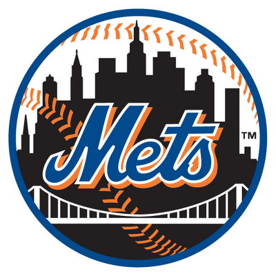
I saw this on somebody’s truck yesterday and it just annoyed me.
I get the “black sells” argument even if I don’t agree with the philosophy (winning sells) but that’s about merch.
Why does this even exist? The dopey hybrid cap has blue and black on it, why couldn’t the uni just have the blue ball logo on it? Why does this logo need to exist at all? Where would it ever need to be displayed that a blue one wouldn’t suffice?
And why is there no NY on it?

I actually like this logo better than the blue one. I think that the black silhouette makes the “Mets” stand out better. Of course, I like black too.
Since you brought it up…this logo is especially hideous, as blue and black do not go together well at all. The NY must be there, per the original art (I posted on this just last week I think). Furthermore, when they added that orange drop shadow, they slightly shifted the Mets script to the left to balance it out. Now the current patch manufacturer (who thankfully corrected this laughable Wilpon Script Patch, has made a patch where the Mets script is too far left:
http://images.footballfanatics.com/FFImage/thumb.aspx?i=/productImages/_190000/FF_190724_xl.jpg&w=180
The only hope for us is the following:
New owners come in, ditch the black, hire a graphic artist to restore all logos and scripts and issue a document to manufacturers (the Dodgers did this in 1999 after their logo degenerated over the years).
the original black jersey had the blue skyline logo. it looked much, much better.
Here is a pic of the old school, beautiful patch:
http://2.bp.blogspot.com/_3pH8F1XaEYc/TB0c4AMeiKI/AAAAAAAALZc/4a2_Btw1ZPU/s1600/Slide3.JPG
Notice how detailed the orange baseball stitches are and how they go all the way around the buildings…they don’t make them like this anymore. I have a 1960s era team issued patch I bought on ebay just like it.
I’ll venture a guess as to two reasons that logo may exist:
1) Somebody somewhere along the line decided the black unis weren’t black *enough*. Thus the black sleeves & socks a few months into ’98 followed by the all-black caps and the “midnight” logo in ’99.
2) They wanted to use it on street apparel and since we all know the Mets tail wags the dog when it comes to this stuff, they plastered it on everything else.
If some minor-league team came up with that logo from scratch, I’d say it wasn’t bad, but it’s completely unnecessary and a vile corruption of the original.
Hopefully when the new owner takes over he’ll restore the classic orange and blue.I’ve heard Einhorn is an old-school Mets fan.Lets keep our fingers crossed.Oh and maybe he’ll de-Dodgerize Citi Field.