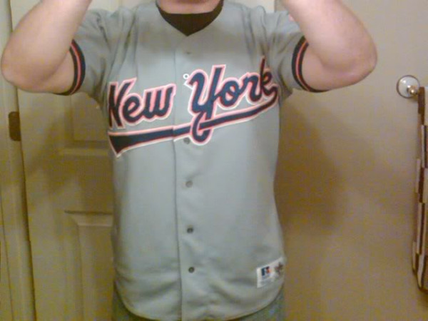
@mezzanine1976 with something so rare I don’t think I’ve ever seen one, including on any Mets. That season was in that magical haze of “girls more interesting than a terrible Mets team that blew a dynasty.”
I don’t hate the underline on the road jersey as much as the home. I do own a home version now thanks to Media Goon’s poor luck with buying sizes.
So..consider how awful the current jerseys are, what do you think of this? Discuss…

I agree that the road swoosh is not so abhorrent. The home swoosh is by far the worst scourge ever released on Met fans. Yes…IMO, much worse than black. If they had not switched back to the correct script (then unfortunately the current crooked M script), I don’t know what I would have done.
This was easily the better of their 93-94 uniforms. The underscoring tail actually seemed to fit with this script, unlike the home design, which seemed too clumsy and awkward to have ever made it onto a major league jersey.
The drawbacks:
– The “creamsicle” (white over orange) trim that adorned the lettering on the different road jerseys from 88-94. This was unnecessary and always detracted from the simplicity of blue & orange on gray.
– This looks like a variation of the 87 road jersey. It’s not identical, but it’s similar enough that you end up asking if they really needed to roll out a 2nd, cursive “New York” logo in 6 years?
– The Mets had such a classic road uniform design in their past, it made so little sense to continuously roll out new designs.
Luckily in 1995, they got it right. (Unfortunately, they managed to mess it up again in 98.)
I agree with jeff..The uniforms from the first 10 yrs. of the ballclub are the best ever put on the field..they don’t need to be messed with at all..
What do I think of it? I own one!
http://216.77.188.54/coDataImages/p/Groups/416/416886/folders/307560/247337393road.jpg
If the Mets can ever get a summer date in Houston or Atlanta, you’ll probably see me on SNY wearing it.
I go back and forth as to whether I like those better or the ’94s without the sleeve stripes, but I really like that script. It matches the “Mets” script. The classic Giants font is nice and all, but this is more distinctly Met.
I like it.
it needs the skyscraper logo on the sleeve.
It’s there, hidden behind the guy’s forearm. You can see the edge of it.
This jersey is not half-bad, actually. The ’94 version with the number on the front was slightly better. It would have been better still without the white outline. I like this script better than the ’87 script.
Of course, as Jeff pointed out, they got it perfect in ’95.
I saw a guy at a Brooklyn Cyclones game wearing a game-worn 1993 Eric Gunderson road-swoosh jersey, just like this one.
GregB,
I’m pretty sure the on field version had the skyline logo on the sleeve.
It definitely did, although the 1994 version was rectangular, with “Miracle Mets / 25th Anniversary” inscribed above and below the circle.