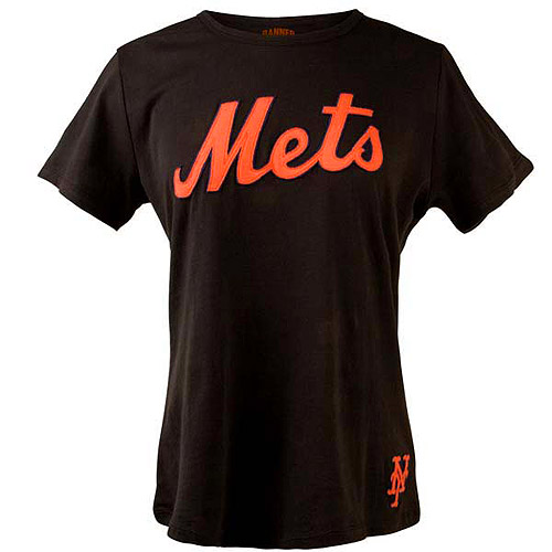
The primary problem with the Mets use of black is that it clashes with the blue. It’s not like I hate the color, and yeah it looks good on civilians.
I saw this in the clearance shop on MLB.com
Here’s how you do it (if you must do it)
What Mets fans talk about when not talking about the actual games.

Comments are closed.
Yea but then it looks like too much like the Giants
Agreed. People get agitated at the suggestion of a white-blue Mets cap, god forbid there’s anything resembling the Dodgers around here, but the Giants are aok. Same logo, same colors, it would work for a lot of Mets fans, I think, as the ‘alternate’. But not me. I love the Giants, but I say give Brooklyn some love.
The black may clash with the blue, but nothing clashes with that beaming bright blue as much as that bright men-at-work color-me-a-road-divider orange. It’s fun, but jarring, that harmony of opposites.