I have no idea where Shannon is, I tried calling him so he could post this. I guess I got this one.
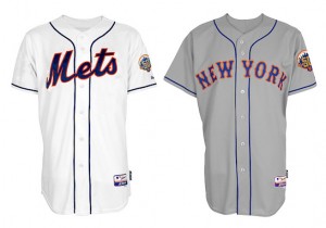
MetsBlog just posted the 2012 Mets Jerseys. No images of the blue Mets Jersey that is supposed to pop up this year.
Quick Update: Jerseys are on sale with a 25% discount for one item on MLB.Com…I just bought myself a road jersey. Came to $132 and change after discount with tax and shipping. (Another update via Shannon: that link is presently down, see below.)
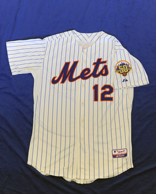
Goon: The pinstripes are looking very nice. (via @AdamRubinespn)
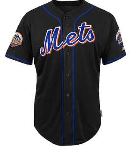
Goon: The black jersey. I think I see a black dropshadow. Is that 50th patch photoshopped in? Its the only jersey to have two patches on it, plus the skyline seems blue.
I am liking the way the jerseys are looking. The patch looks nice too. When are these for sale?
Michael Baron: (posted Nov. 14, 2011) I love them, although I think the black is a little played out at this point. As Matt has said, the black was a symbol of the late 90′s Mets, and I think the new uniforms (with the exception of the black jersey) not just speaks to their history, but their original branding of orange and blue as well.
Read the rest over at Metsblog
…
UPDATE 6:37am
Shannon: Well this is an exciting surprise. I grabbed my phone and was wondering why Goon would call me at 9:30 at night.
They of course look fantastic. The skyline patch with gold looks cool (was trying to drop you guys hints).
The link to mlb.com is down – I’ve heard in the past that things leak because MLBAM controls the websites and they test the pages live…there was some leak during the season that I can’t remember but it was the same thing.
I have to get up and out the door but I’m sure we’ll talk about this all day.
It appears as if the Treaty of Flushing has been signed. Let us rejoice.


I really like the pinstripes. As far as the rest, I’d gladly keep the black drop shadow if it means I can keep the numbers on the front too.
I hope these will have the player’s name on the back – nameless jerseys may speak of tradition to some, but they remind me of the minor leagues where the jersey might end up being worn by two or three different players during the season.
I can’t see them not having the numbers on the front. Maybe the pinstripe one was done to show how the retro look would be with numbers?
Hmmm…is it me or does the Mets on the black and snow white look a bit larger and less crooked in the M? The pinstripe looks like the crooked M we are used to.
The New York looks great without the black…in fact I own that jersey already…bought it in 1996.
Why does only the pinstripe have front numbers? Why does only the black have two patches? These inconsistencies lead me to believe there may be subtle differences in what we see Wednesday.
The patch is similar in concept to the one I did…replacing the Mets in the ball logo with a 50.
Shannon!!!! You did it! You did it man!!!! No stupid dropshadow! I’m willing to accept the black jersey as long as they finally get rid of the stupid hybrid fitted. Blue and Orange all the way. 2012 might not be an exciting year, but at least they’ll look right when they take the field.
I have been trying to get in touch with Shannon since Metsblog posted this. He is MIA for one of his big achievements with Metspolice.
Yes under the terms of the Treaty of Flushing all bitching about the black will cease as part of the compromise.
Does the Treaty of Flushing have any provisions for the hybrid caps? I can live (barely) with a very limited black alt (until the blues come in full time), but the hybrid cap has to be part of the purge
To me it looks like the black was photoshopped. I bet the 50th patch is on the left sleeve and only one patch for that jersey.
Also I feel like each image (except for the pinstriped one) is for use in the Mets’ online store, and for whatever reason the pictures of jerseys in the online store never look right proportion-wise – the script “Mets” looks too big, the torso looks too thin, etc., etc. I wouldn’t put that much stock in the images that make it onto the online store.
Nah, since the black is the only retread uniform, I bet they simply add the 50th Anniversary patch on the right sleeve of uniforms already in stock. That way no need to cut off old patches (with the hazard of damaging the jersey), saves money.
I love the pinstripes too – looks so classic. No dropshadow helps it look so clean. I also love that the script/text/numbers on these don’t appear to have the extra outlining that the 1995-97 “throwbacks” did. Hoping for 1960s-era numerical font on the roads, and a blue squatchee on the caps! Can’t wait to be able to buy these!
AMAZING. Looks infitely better and classier without the black shadowing. And they will wear the blue caps on the road! And I figure the black jersey will probably be phased out for a blue one next year. Don’t care for a blue alternate but it will be better than the black alternate for sure. And gone will be the black and black/blue caps probably completely in 2013! Is this a dream?
Finally, I love the classic pinstripe without the dropshadow. Has anyone confirmed if they are dropping the orange squatchee on the blue hat? Please, please bring back the solid blue squatchee cap w orange NY. If there’s going to be Alts, how about honoring the 86 uni, afterall that team was probably the greatest ever!
Where’s the chief? Hope he’s not pulling a Doc Gooden at the WS parade.
I was actually watching Vietnam in HD upstairs and went to bed around 10. Great line Steve
Can’t tell from the photo, is the pinstripe jersey white or cream?
Remember, Remember the 16th of November
Will these jerseys not have names on the back like the 60s ones?
Check out our site tomorrow for that info.
Does anybody know if they still intend to wear the black and blue hat on the road or will they do it right and wear the blue hat with the greys????????
blue hats from what i’ve heard. Hybrids are finished
what a way to celebrate Dwight Gooden’s 47th birthday tomorrow than by ridding Mets fandom of the scourge that is the black shadow!! I can live with the orange button and the black once in a while but the shadow has been a pox on 2 classic looking uni’s – the pins and the roads. I have known Metspolice for 28 years now and finally getting some payoff on this friendship…………………………………
They could have waited an extra day and celebrated The Franchise’s 67th birthday.