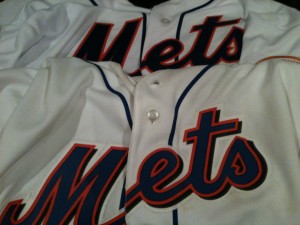
Below is a shot of two jerseys. The bottom is a 2010 (or so) replica. The top is the 2012 authentic I bought today. I’m mentioning that one is a replica in case you jersey experts know things I don’t about colors.
Click on the image for a bigger look. This isn’t a lighting thing..as soon as I got my new 2012er home I the blue really caught my eye.
Also, when you see them side by side – isn’t the top a much cleaner look? That’s why I had been railing about this.
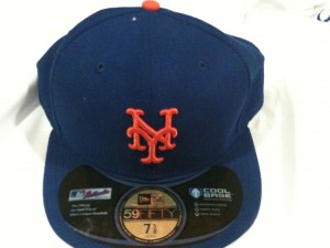
Here’s the New Era Fitted I bought. I didn’t have anything to compare it to since my usual go-to cap is a ’47 shop type.
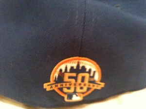
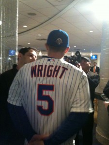
The caps have a 50th anniverary patch on the back as you can see here on the consumer version and here on David Wright.
UPDATED: People are telling me I’m nuts. Uni Watch is seeking an official answer. Regardless, I own two jerseys, one is an authentic which has a darker blue than the replica.


I like the black.
Name and number on the back look great. That’s what it’s supposed to look like. So clean.
So jealous you already have the cap!!! Went to the clubhouse shop in Manhattan and they had no idea new stuff was released.
the color scheme on the pinstripe (see Wright at the bottom) looks perfect. but i think you’re right that the blue looks darker on the new jersey, compared to the 2010 replica. in the 2010 model, you can see the orange outline very distinct from the blue fill, but in the new jersey, the colors really blend together. looking again at the picture of Wright’s jersey, i can see a distinct difference between the orange and blue. but i remember seeing that phenomenon before (I think it was on recent 1986 replicas).