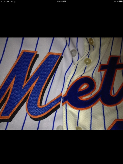
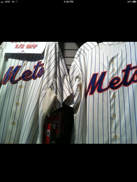
Officially the 2012 Mets blue is the same they have used since 1995.
@coreynyc was in the team shop yesterday and had his doubts
See how “Mets” is just way more crisp on the right? That was the point all these years. It’s just better branding. Maybe someone likes wearing a black jersey, but the drop shadow did nothing good for the look. (Also notice that the e and s now have an inner hole).
Anyways, that started a twitter discussion. Then @joeloverde81 posted this 2008/2012 comparison.
Hmmm.
When the Mets tell me something I stand by it. However, I’m heading out to the Holiday Party today, so maybe I’ll see if I can meet Kevin Kierst to find out what we don’t know. At worst I have a small-talk topic.
As for the “white” – 2011 pins were “cream.” 2012 pins are “ivory” and 2012 pinless are “snow-white” per a Mets official quoting Kierst to me. If you compare a 12 pinny and a 12 pinless side by side you will see the difference in whites.
I don’t know what official color the 2008’s were.
I recommend buying yourself a 2011 cream-pinstriped-with-dropshadow for your collection. They didn’t see all that much game use and they weren’t around very long. Some day you’ll wish you had one like this fine fellow. (I also own that green Murph.)
More later from the party!


When they went to the swoosh in 1993, they also publicly said they went to a blue “one pantone color” darker. Anything is possible. The old glacier twill makes it harder to compare also. One thing my eye is detecting, as I said before, is the script looks “chunkier” than my ideal Met script in my head…the letters seem thicker and not as flowing to me, but that is just from the photos. I’d have to have a pre-drop shadow jersey and the new one in front of me to really compare.
I agree the glacier twill might figure in. The texture catches more light and is more reflective (for lack of a better term). Untextured, it may be the same color, but practically speaking, it certainly presents as a different shade.
It’s the twill. I just discussed it at citi field. It’s the same blue.
It also has to do with colors looking lighter or darker next to certain colors (i.e. black next to blue). I always thought the blue script looked more purple on the field with the drop shadow. It’s all a trick to the eye. Or maybe they really did use a different shade blue. We will never know for sure.
yeah the blue/black really does look purple
Mets blue has often looked purplish at times during the years…in this photo, Gil’s blue looks purple compared to Davey. It could be a simply case of manufacturers changing over time and nobody from the Mets dictating standards properly.
http://cbsnewyork.files.wordpress.com/2011/03/casey-stengel-gil-hodges-davey-johnson.jpg?w=300
Do the Mets have a full supply and a section for “Basement Bertha” items this year. They certainly are going to be needing a large inventory.
Maybe the Mets shoudn’t bother putting names on the back on the jerseys, so they don’t have to use half the shop as a clearence rack for traded and lost players!
I think the difference is more in the inside design of the lettering. That “Icicle” figure that is inside the blue color is no longer there in the new set. That also may explain why it looks much more crisp and clean. It’s not as choppy. Thus the blue is more consistent.