I know some of you are aficionados (or actually whatever the opposite of aficionado is) of the Wilpon Script (read more here on Uni Watch).
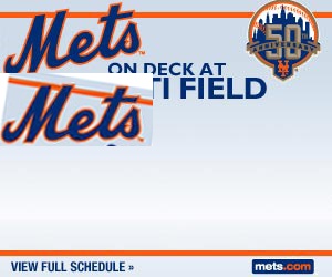
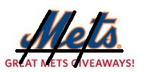
The image below appeared in an email from the Mets yesterday. The M looks like it’s going to fall over.
I tried to put some lines through it (I have seen some of you graphics experts do that sort of thing) and I guess the M and the T line up nicely, but the left tail of the M is floating in air which is what I think causes the effect.
Thoughts? Comments?
Media Goon weighed in:
I think i figure out why it looks so off…..its flat. almost everytime the mets logo is seen it has an angle to it such as….


Here’s a guest post I did on this last year. It looks like the uniforms are fixed, but print media is not.
https://metspolice.com/2011/07/29/steve-wants-the-mets-wilpon-script-gone/
Paul Lukas calls it the Wilpon Script. Like anything to do with the Wilpons, it’s out of kilter.