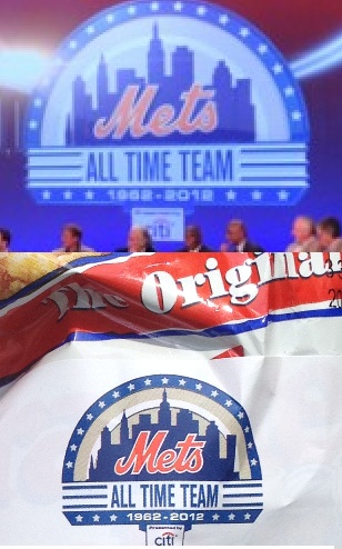
Eagle eyed Steve D pointed this out. Here are two images of the Mets logo. One from Sunday, one from Monday. Take a close look at how the M hooks into the e.
What’s interesting is on the ball logo the M to e seems to have the dip whereas on the uniforms it does not. And I guess it’s been that way since the start. And in 1962…sort of cut the middle.


this is the old “wilpon script” stuff that supreme commander lukas has discussed:
uni-watch.com/2010/05/06/consistently-inconsistent-2/
The buildings are not the same on those two logos from the other night. Weird that they aren’t consistent.
I didn’t even look at that…usually they don’t mess up the buildings, aside from the Williamsburg Bank that has been screwed up since the 90s. The TV logo buildings look ridiculous…great catch.
Yeah this whole graphical comparison is a disaster if you ask me. I would say the 2nd graphic (the one on the banner) is the one they should have gone with. Oh well.