@metfanvin took these screenshots from MLB 13: The Show.
Like Mets Police? My eBook Send The Beer Guy is all about the Mets and only $3.99 for kindle and kindle apps which are a free app for whatever you are reading the on: computer, iPhone, iPad, etc
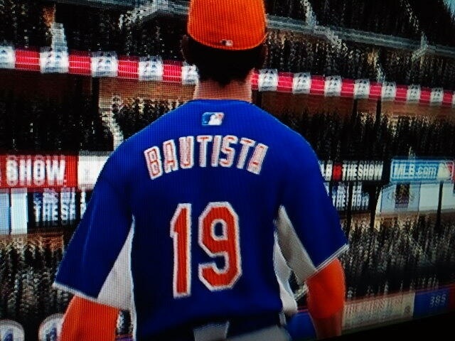
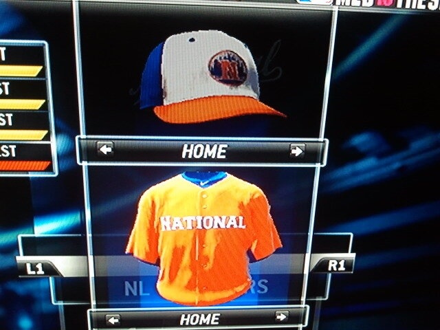
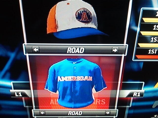
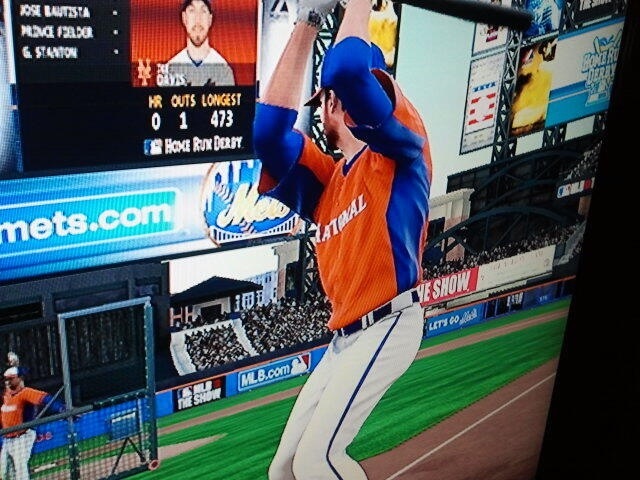
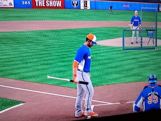
Those are absolutely horrible. Especially bad are the white front panel caps.
Nice way to ruin what would have been pleasant memorabilia collecting!
Somebody break out MLB 12 The Show and see if the jerseys for the 2012 game were accurate. There’s still a chance a patch altered them later and/or these are just an attempt to represent or a non-final prototype.. but it’s looking grim. That hat is HIDEOUS!
crap crap crap!!! National league should get the blue and American league should get the orange! Why do the mets mess up on every decision somebody has to be fired! they look horrible and the hats hideous. looking forward to them and now I don’t even want to look at them hope this isn’t final praying for a change!
I don’t think it’s a Mets decision. It would be decided by MLB.
Stop being a baby! Wilpons ruined everything cause national league is orange. Grow up!
1) hats and jerseys are designed by MLB Wilpons/mets hve no say
2) design is consistent with past all star games. Home team gets secondary color and the mets colors are blue and orange….so orange would be appropriate.
3) you’re an idiot