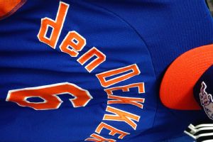
The Mets decision to invest in lowercase technology for the uniforms of Travis d’Arnaud, Matt den Dekker , and pitching prospect Jacob deGrom, has been met with mostly praise from the media. Shannon was among those in social media who mocked the Mets use of an upside-down capital “P” in the past.

An article in the Wall Street Journal explained that Mets equipment manager Kevin Kierst, is the man responsible for the change.:
Kierst, irritated by the controversial upside-down “P” technique, set out to find a solution to the Mets’ orthographical dilemma. Since Major League Baseball’s uniform supplier, Majestic Athletic, didn’t produce lowercase letters, he designed a set himself in the hope of having them approved for use.
Now, with some help from Majestic, the approval of the league and a large amount of work by Kierst this winter, the Mets have an entire new alphabet at their disposal.
“It’s all about being consistent,” said Kierst, who has an artistic background—he used to paint signs on the outfield walls of minor-league ballparks. “If this is the way they spell their name, then this is the way it should appear on their uniform.”
I must respectfully disagree with Mr. Kierst and Mr. Shark. I feel like I will be the lone voice here, but I think the new uniforms look silly and are improper. So, I will take this opportunity to make my case against lowercase lettering on uniforms.
ALL CAPS is ALL CAPS. Daryl Strawberry’s uniform read “STRAWBERRY,” not “Strawberry.” Why is a lowercase letter important just because the proper spelling has it in the beginning of the name?
If the Mets want to leverage lowercase technology for Travis d’Arnaud’s uniform, it is silly to use “d’ARNAUD”. Shouldn’t it say “d’Arnaud” if we are going to go that route? I contend the best use of lettering is to be consistent, and stick with “D’ARNAUD”.
As an example, look at this book about the famous painter Vincent van Gogh. Notice the cover reads “VAN GOGH,” not “van GOGH.”

I think the efforts to correctly spell athletes names is an honorable endeavor, and I agree that using an upside-down “P” was goofy, but this just does not sit right with me.
Whether you’re with me or against me, let me know on twitter or in the comments section. Follow me @verceman and CC: @metspolice I believe there are more ALL CAPS purists out there than we realize!

With all due respect, you really need to get a life.
I agree. I think this looks dumb.
That’s insensitive to those of us with surnames that do include capitals letters in the middle. Some of us our proud of our ethnic heritages, and wear our names with the spelling that our ancestors deemed correct, in their languages.
metspolice I love that we are debating uniform lettering instead of ponzi scheme settlements.
You’re an idiot.
You’re not alone. I also think it looks goofy for the exact same reasons. Smaller versions of capital letters is a much better combination of authenticity and consistency, but even there, Majestic came up short for the Mets’ needs (they only made “C”s, “A”s, & “E”s IIRC). Ultimately, I think it should be left up to the individual player, so kudos to Kierst for providing the option.
BTW, I don’t know what I’m missing on this whole new “d” vs. the inverted “P” thing, but I’ve yet to see a photo in which I can discern one lick of difference between the two.
I agree 1000% with you. Very well said. None of us write our names in all-caps in real life; the convention has always been that on sports uniforms, the names are all-caps (save some Puma soccer kits, but that’s a different matter). And Sparks3rdCoast- no it should not be up to the players IMO. One team, one standard per team. You shouldn’t have MC GWIRE and McEWING on the same team. Looks disorganized.
Finally!! Someone has got it right! Shout it louder. I’m with you.
verceman bingo. All caps.
@MJ Sparks3rdCoastThat little bit of inconsistency wouldn’t bother me, but I get your point. Maybe the Mets could let the 3 guys in question put it to a vote. 😉
metspolice what if we went real nuts and just used exclusively lowercase letters? #intermets