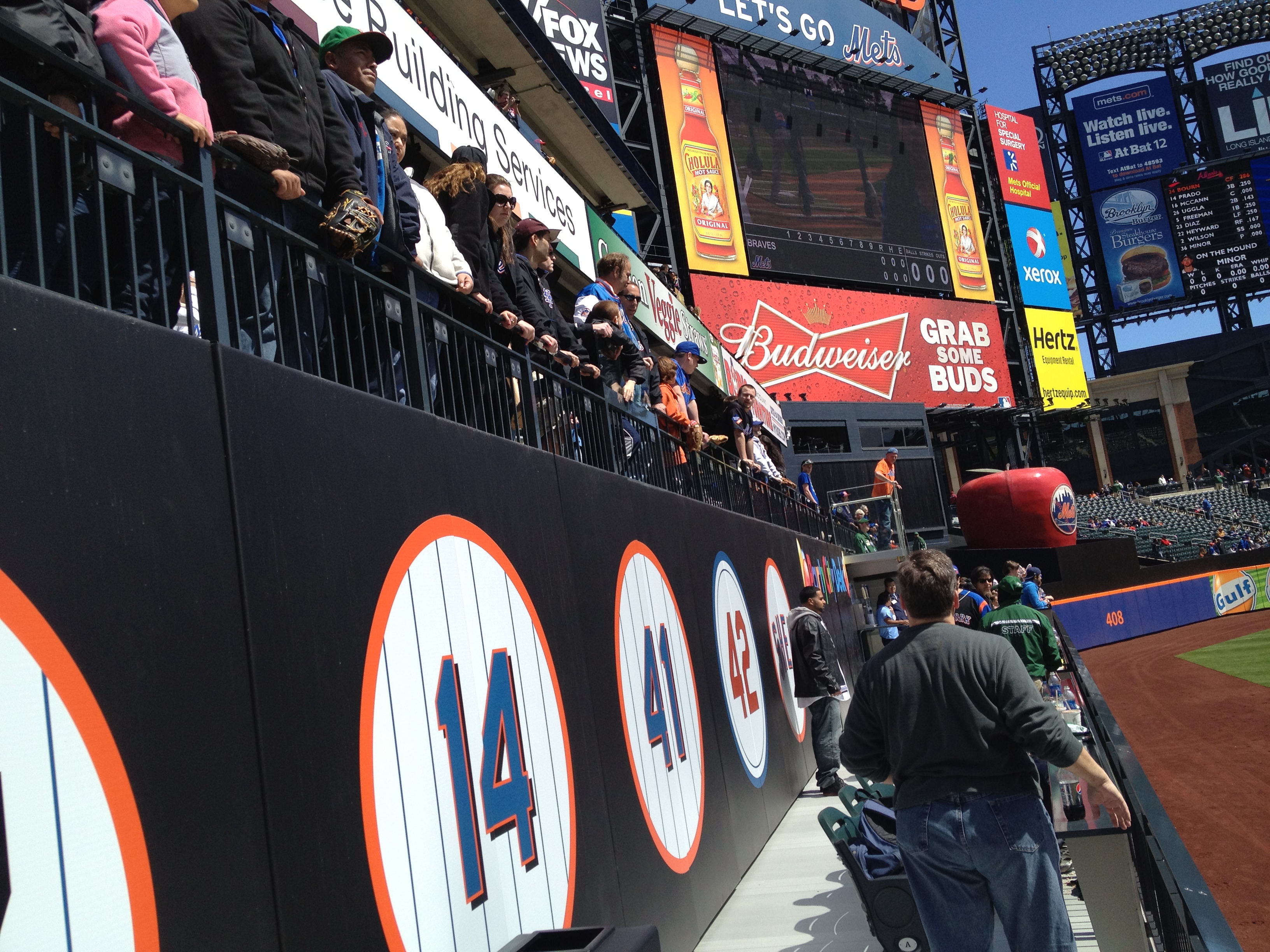
Here’s what we’re doing. We are crowdsourcing 41 ideas for the Mets. The ideas can be big or small. Email me your idea at shannon@metspolice.com. Today’s idea is from Ryan.

– A new place for the retired numbers. They seem like such an afterthought on the Party City deck. At least re-do them and get rid of the black dropshadow.

metspolice Add #36 wherever you put them!
metspolice I like the retired # idea. I’d like to see them to somehow put the name next to the number like many other teams do.
I agree with this article and that first comment. Make them with the name above the number. If you have to change the shape into a box or a jersey so be it. I think hanging them on the shea bridge or below it on the wall would be cool. Also shea bridge should be remodeled and painted blue with the old mets vegas style lights above blue smoke put on top or those lights can go above the main led screen like ar shea. Point is they need to embrace history and familiarity and not hide it in the back where you can’t see it from everywhere you are!
metspolice my personal thought on the #’s is the number should match jersey worn in era. So 31 should have a drop shadow. 41 should not.
@willmusto metspolice Numbers matching the player’s era is also a good idea. That would also make it not look like an afterthought.
JRobelen metspolice admittedly not a 100% original idea; that’s how the Braves do it, and it looks fantastic. The Mets are close…the 42 is in Dodgers colors. Just continue that line of thinking.
Yeah that would be cool if they made the numbers look like the jerseys with the names! Like if they ever retire Carter or Hernandez’s number they could put the piping down the arms of the jersey or with Hodges single and seaver they could make them look like the old cream color jerseys with the MLB patch on the sleeve and with piazza they could just leave it with the drop shadow or the black jersey! that would be cool to represent all the different eras jerseys with those numbers! HISTORY HISTORY HISTORY! EMBRACE IT METS!!