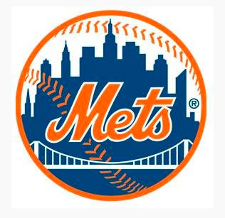
The below is 100% speculation.
2006: The Mets announce a deal with Citi to sponsor new building.
TBD: someone somewhere mocks the Citi Building logo. People mock up things all the time. Maybe it gets considered, maybe it gets rejected. Maybe it gets immediately rejected with a “are you crazy???” Maybe someone emailed it to someone with a “how about this?” Whatever the internal discussion, it gets saved on a computer somewhere labeled something like logo.jpg
Note that the colors are “off” on this logo.
Off-season 2008-09: Citibank receives a government bailout. Several articles are written about the sponsorship of Citi Field. If the logo was ever considered at all it definitely does not go into circulation.
April 2009: Citi Field opens with traditional logo. You remember there were not a lot of “Mets things” in the park at first.
November 2013: someone updates the Facebook page, innocently grabs a logo that has been in the system for years. Doesn’t notice. Mets Police does not notice, you do not notice, nobody notices.
I think it’s just an old mock file and an innocent mistake.
To me the story isn’t the use of the logo yesterday or in November, the story is how it came to exist in the first place and what the possible intentions were. (or why a mock would have an R not a TM).
I don’t think this was a “float” at all. I think it’s just that a never-meant logo got out innocently.
I know a few folks are digging more, but that’s my working theory of what happened.

We’re calling Oliver Stone!
metspolice I agree. Nice detective work. That’s where Mets Police really shines.
.DyHrdMET I appreciate the love but I didn’t notice it, i didn’t notice the ace book logo history, credit to others. The theory part is me.
metspolice detective work is a team effort
From a comment I posted on today’s UniWatch
“…Logo was uploaded in Nov. 2013 right? This would make some sense, as the team would be changing over from using it’s 2013 All-Star Game logo.
And, if you think about it, they also used an alternate logo in 2012. The 50th Anniversary logo.
This time frame also includes the Mets pulling back on the usage of the blackened version of their primary logo, and the introduction of usage of the Mr. Met patch on alternate game uniforms.
So, it could be the team had marketing look at some alternate logos to begin using at the end of the 50th/ASG logo period.
The CitiCorp building was one of those, likely not selected, as the team went with the standard logo on standard jerseys (pins, whites, greys), and Mr Met on alternates (blues, camo, BP).
The “Citi” logo was sitting in a file of images, and some lackey gets told “change social media logos back to regular ball logo” and they see “ball logo” and use it. Not realizing it’s “Citi” version…”
Also, the more I think about it, this “Citi” logo seems familiar.
Like something that was produced, not by the team, between time of the naming rights being announced and the uproar over Citi got TARP assistance