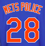
@metspolice @UniWatch @PhilHecken How about a reimagined Mets logo for the 21st century? Here ya go: http://t.co/6lsJ7tIhZZ
— Todd Radom (@ToddRadom) September 16, 2014
One Reply to “Unofficial concept design for a 21st century Mets logo”
Comments are closed.

Don’t like the Highline in it