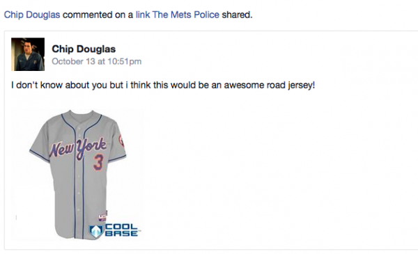
Mets Police officially endorses the current road jersey to be the road jersey until the end of time. However, Mets Police also enjoys discussions. Discuss.

What Mets fans talk about when not talking about the actual games.

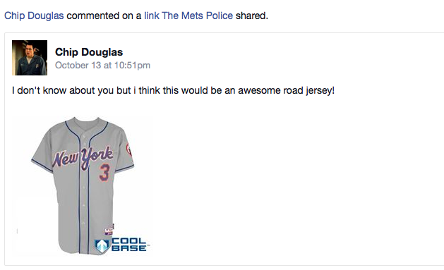
Mets Police officially endorses the current road jersey to be the road jersey until the end of time. However, Mets Police also enjoys discussions. Discuss.

Comments are closed.
Interesting. Swoosh jersey without the swoosh. I guess I am still one of the few who ever liked it. And I like it sans the swoosh.
I’ve never seen this one for sale before tho — and it has the cool base logo on it. So now I wonder what’s happening here … if anything.
kevincanessa It’s likely ‘shopped, using the wordmark from a ’87 road racing-stripe jersey, pasted onto a current current road jersey
FormerDirtDart kevincanessa I am an absolute idiot for not thinking of Photoshop — thanks, mat.e
This looks like the road script from 1993-1994, sans swoosh, on a jersey with the current piping. (The 1987 script was slightly different, particularly the lowercase “n” in “new York”). I could do without the white outline around the orange trimmed letters & numbers, (gave a cheap look to the 1988-94 grays). All in all, it’s sharp looking, but unnecessary.
The current road uniforms are a classic & should be left alone. Any time the Mets have strayed from either the cursive “Mets” or old-style “NEW YORK” road font, it’s always had a knockoff look you’d see might see in an ad campaign where they didn’t pay rights fees.
I don’t like it. The current road jersey is a classic.
(Now if only we could get the Mets to simplify the number of home jerseys they wear – would anybody really miss the “snow whites” if they were retired?)
the road now could only be improved if they went back to the number style they used from 62-73. They wont do that so just LEAVE IT ALONE. I fear the day that Jeffy gets bored with his toy and decides to change this up. we endured many years of the black shadow which was awful, lets keep the good stuff we have. Now if they could just in them!