I was minding my own business on twitter when this caught my eye…
Dave Kingman & George Foster at good ol’ Shea. pic.twitter.com/08Iwqp9tXH
— Sports Paper (@SportsPaperInfo) June 21, 2016
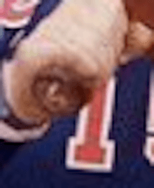
There. Do you see it?

Typically a Mets 1 doesn’t have the bottom crossbar (or whatever the term is called).
If you do a Google Image search for “Foster Mets” you’ll see all kinds of shots with a 15 as I would normally expect. There are also a few with this oddball 1.
What am I forgetting?
Also of interest is this picture showing Foster in the rarely seen blue with the NY crest.
EDIT: Greg Prince (Faith & Fear) says it’s 1981 road font. 1981 road font? Why would they have 1981 road font? The old road font had that kind of 1 (look up some Seaver stuff)….so OK why the orange Mets then. Were we not doing the gray lettering on roads yet? Thanks Greg!
