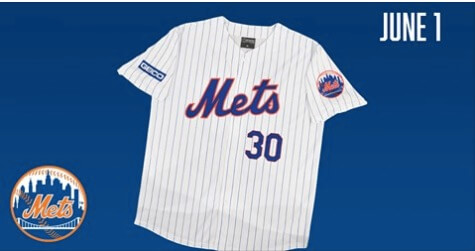
The number font on the Mets Conforto giveaway jersey looks fugazi

Why can’t they just get the numbers right?  My guess is these numbers cost like 1/100th of a cent and numbers that look better might cost 3/100ths of a cent. (My costs may have underestimated actual pricing, but you get the point.)

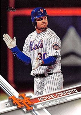
As a comparison here’s how it should look.
The Mets Police
Privacy Overview

This website uses cookies so that we can provide you with the best user experience possible. Cookie information is stored in your browser and performs functions such as recognising you when you return to our website and helping our team to understand which sections of the website you find most interesting and useful.