We have had a nice run of uniforms in Queens going back to 2012 when the Mets finally came to their senses and straightened out the look.

As we head toward the 2020s (not so far away!!!!) and another rebuild I am fearful someone will get crazy ideas.
Teams have a few moves to generate interest. You can win games. The Mets tried that and it doesn’t work. You can build a new stadium. Did that and can’t do that yet. The third option is the Visual Refresh. That’s when bad things happen.
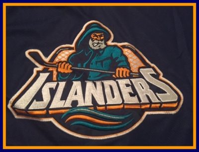
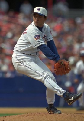
See what I mean? None of that turned out well.
I think we’re safe for 2019 as we’d likely have heard rumblings by now, especially if we were looking at major change….but with Nike coming in 2020, and their tendency to tweak jerseys when they take over properties….let’s be wary.
Let’s take a look at what COULD happen!
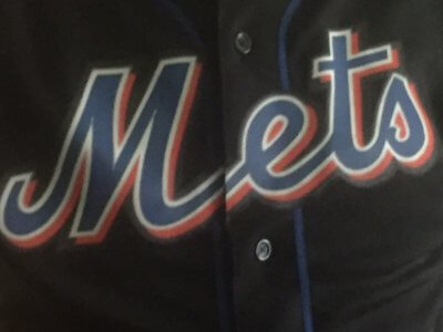
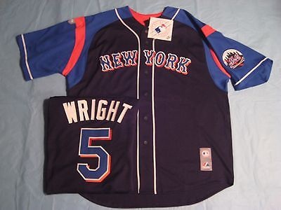
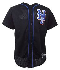
BLACK. I could totally see this returning soon. It’s been gone long enough that people will welcome it. Hopefully this time the Mets understand the difference between once a week and completely junking your branding.
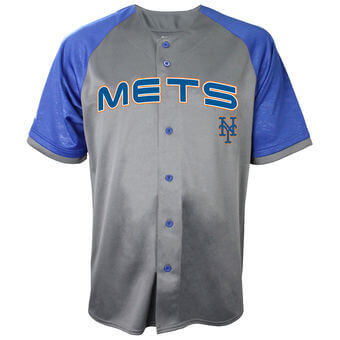
UNFORESEEN HORRIBLE “MODERN” DESIGN. What if the Mets lose their minds and go for something completely utterly different?
SWOOSH. Nike. SWOOSH. You know this is happening.
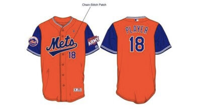
COLOR SWOOSH. The T-Shirt guy made these….think Players Weekend meets Swoosh.
INSANITY. I don’t think Nike will go this far.
MIXING IT UP WITH A CHEST CREST. This kind of idea goes back to the 80s. We’ve never seen it as a game jersey, but I don’t think it’s crazy unlikely we eventually see something like this.
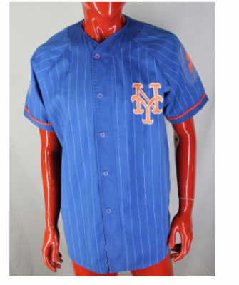
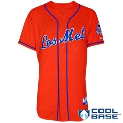
COLOR FLIP. This but not Los. I could see it.
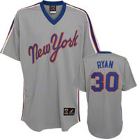
ROAD JERSEY SWITCH. Never mind the cheap name lettering on tieback, but the Script NY on the front. The current road uniform is perfect, but that’s not the point of this post. I think these would look horrific on modern players.
METS MOVE TO ANOTHER PLANET AND SCRAP EVERYTHING. Well, 2021 is coming.
