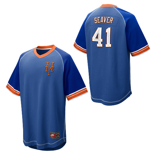
From 2010, this bad jersey.
There may be some ideas here worth exploring.
Would a blue pullover look OK? What if we made the NY bigger? What if we bothered to use Mets number font? What if the front said Mets? What if the blue was uniform on the uniform?
Maybe I am just pulling this uphill…
