Hey, are you killing lots and lots of time stuck somewhere? Because I was when I wrote this!
And in today’s Off-season filler, let’s compare the T-Shirt Guy’s new Home Run Beanie (he doesn’t advertise, no affiliate program, I don’t link, you know where to look) vs the Actual home Run Apple.
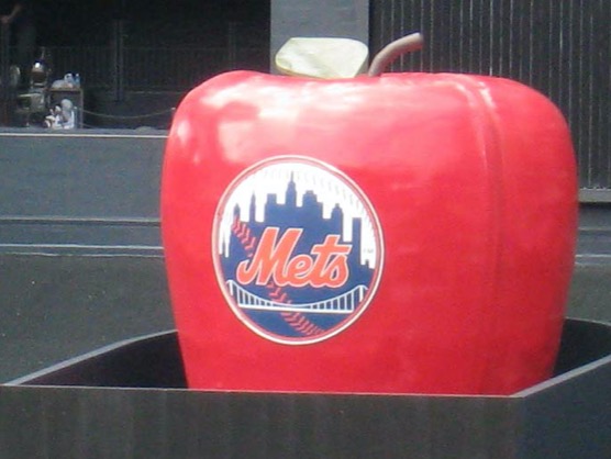
Here’s the Actual Apple, Shea Stadium version
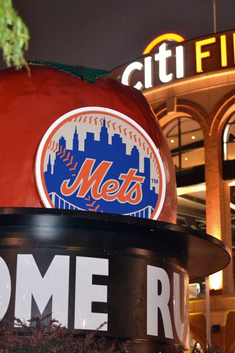
Here’s the Fugazi Citi Field version
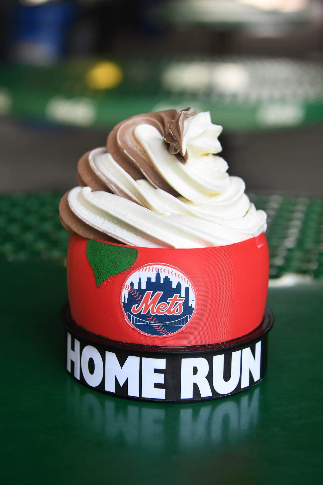
Here’s some Apple ice cream which has nothing to do with what we are talking about, but I found it in my Images sub-folder and I am bored.
And here is the 2020 T-Shirt Guy Super Deluxe New Version Apple Beanie Cap.
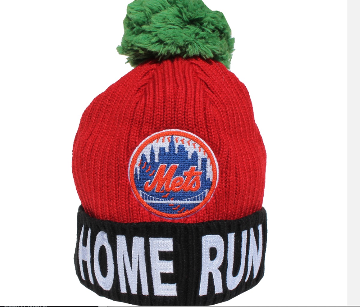
Note the cap says HOME RUN at the bottom. That leads one to assume we are mimicking the Shea version here not the Fugazi version. The Wilpons should have used the Original Apple anyway. I know they claimed blah blah it was old and damaged etc….guys it seems quite fine sitting out in the elements, but we digress.
Let’s nitpick!
- Clearly the Shea Apple doesn’t have a giant green pom-pom. But it’s a hat. I get it. ALLOWED.
- The T-Hat has three stitches on the baseball on the top before you get to the Empire State Building. Clearly there should be seven!!! OUTRAGEOUS!!! FAIL!!!!!
- Same nitpick about all the stitching. Outrageous. Covered. Fail. Move on!
- Why doesn’t the beanie have enough white space between the buildings and the outside of the baseball. I mean – what is this? Are you kidding?

Clearly there should be this much space!
I mean what are even doing here?
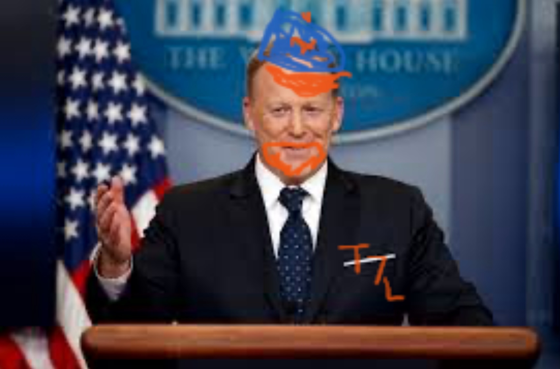
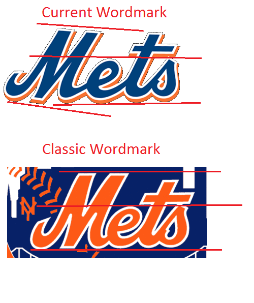
I am sure Sean “mediagoon” Spicer will defend this on twitter, but this is an incredibly reckless design as bad as the Wilpon script
I demand an immediate recall and replacement of this abhorrent beanie! More stitches! More white space!
Even the cup of ice cream got it right!
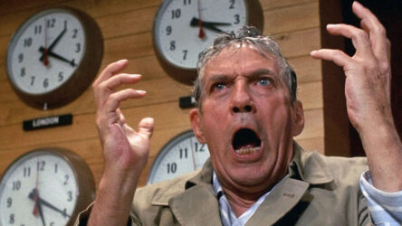
Do I actually care? Not at all. Off-season filler? Off-season filler. Get a beanie cap at your local T-Shirt Realtor.