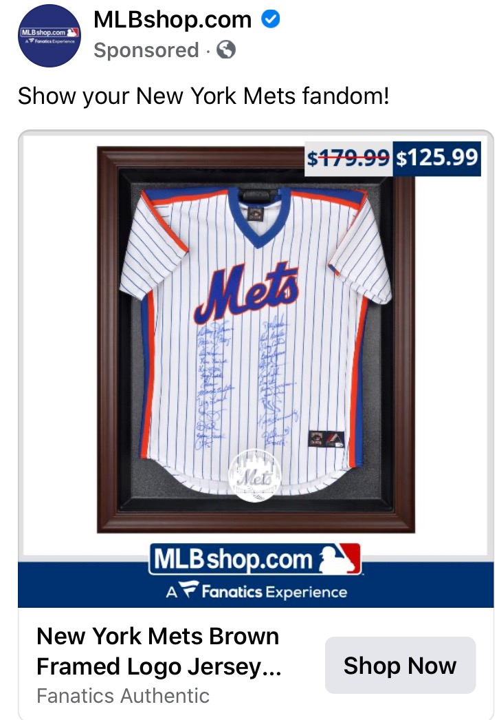
Is it me or is the jersey that the MLB Shop has framed here a little fugazi looking?

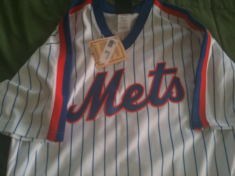
For reference here is what such a jersey should look like. Compare, for example, where the T-S is in relation to the collar.
Also take a look at the way the M connects into the e.
But hey, it’s a Fanatics Experience.
