Mets Queens jacket design starts off nice before being over-engineered into mess

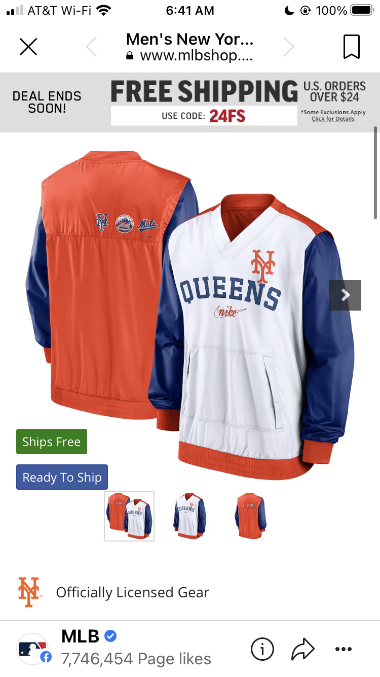
This could have been something.

When I travel the world I often will say I am from Queens rather than from New York City.

The front of this jacket – white with Queens on it – is a good start.  Add on a Mets logo…ok.

Blue sleeves…ok

Orange on the shoulders – too much

Orange on the back….way too much

Three logos on the back…wayyyyy too much

One of those logos is the swoosh logo? Why that???


The Mets Police
Privacy Overview

This website uses cookies so that we can provide you with the best user experience possible. Cookie information is stored in your browser and performs functions such as recognising you when you return to our website and helping our team to understand which sections of the website you find most interesting and useful.