Black on Black bad font Mets jersey

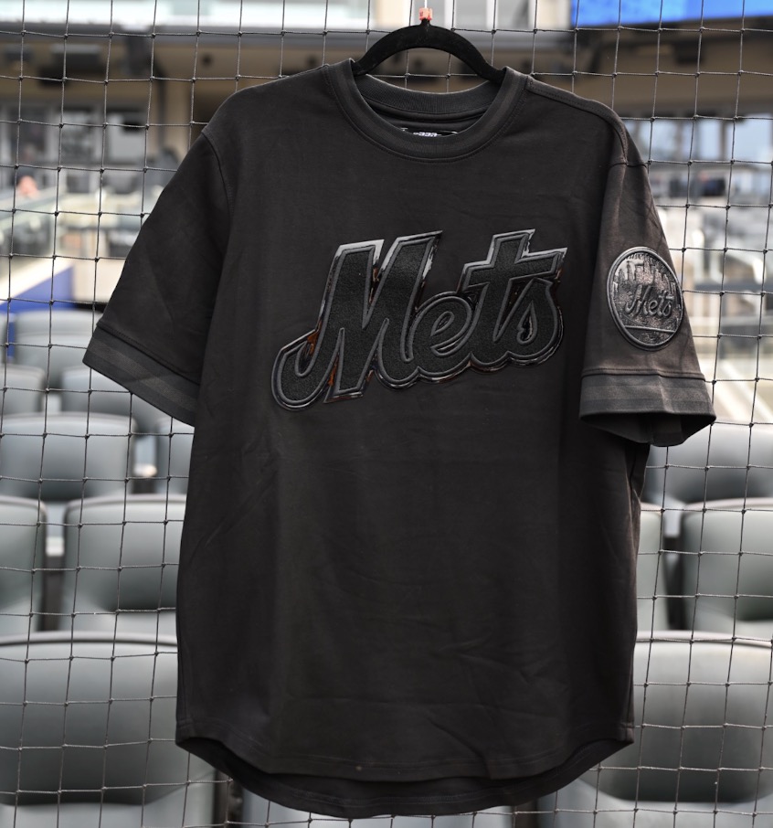
There’s so much wrong here, but at least you can’t see the netting.

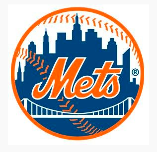
As a reminder, on the ball logo Mets looks like that, with the M not becoming the start of the e (think about how you yourself would write Mets in cursive)

But on a jersey it should look like this  Well not with the long tail e…but you get the idea…note how the M sweeps cleanly into the e.

The Mets Police
Privacy Overview

This website uses cookies so that we can provide you with the best user experience possible. Cookie information is stored in your browser and performs functions such as recognising you when you return to our website and helping our team to understand which sections of the website you find most interesting and useful.