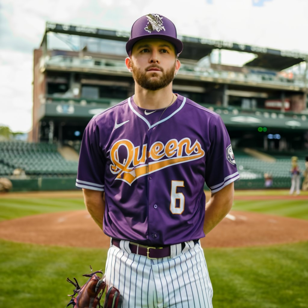
Remember when we thought the jerseys were going to be purple? Would that have been better?
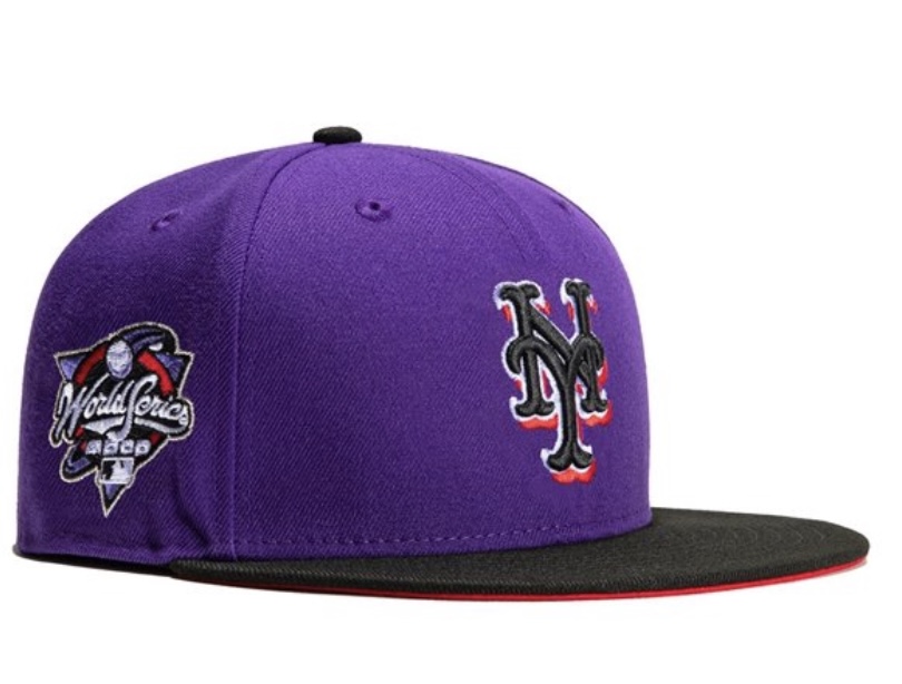
Imagine something like the below with a different cap and numbers that match the letters here.
BTW I was in LA recently and out there the nomenclature is “Line” One takes the E Line to Santa Monica for example.
The Mets must have hired some West Coasties in marketing because their whole “If You Know NYC….” campaign was exposed when they started talking about the 7 Line as a subway.
The 7 Line IS an apparel company.
Real New Yorkers take The 7 TRAIN. They take the Flushing Line. They do not take the 7 Line as that’s a thing you wear not ride.
Do you take the 4 Line to Fake New Yankee Stadium? You do not.
Is the song Take The A Line? It is not
If you actually know New York, you know.