Steve, today let’s talk about the visual identity.
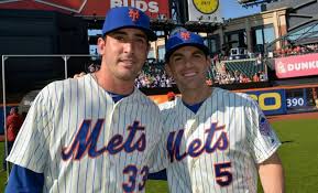
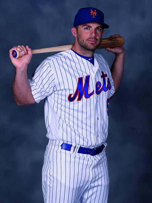
Let’s start with the obvious: the Mets’ colors are blue and orange. It’s in the song. These bold, vibrant hues have been with us since day one, and they’re an integral part of our history and identity. When you see that perfect combination of blue and orange, you immediately think of the Mets.
The Mets’ primary logo, featuring the iconic skyline of New York City and the stylized “Mets” script, is another essential element of the brand. This logo perfectly captures the essence of the team – a club that proudly represents the greatest city in the world, with a unique style and character all its own. When you see that logo, you know exactly who we are and what we stand for.
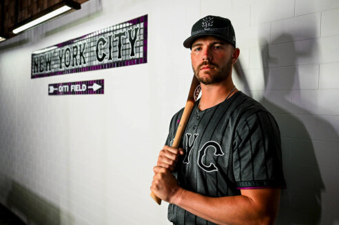
While the City Connect uniforms attempted to bond with the city, it was clearly a concept executed by Fake New Yorkers. The proof there was the phrasing in the marketing about the “”purple for the 7 Line.”
Real New Yorkers take the 7 TRAIN. They might take the Flushing Line, but there is no mode of transportation called the 7 Line, that’s a t-shirt company. Is there a 4 line? Did Duke Ellington take the A line? No and No. There is no 7 Line. It’s a fatal flaw in the branding attempt. Also, you wanna bridge New York City? How about a logo with the skyline and, you know, a bridge. Maybe somehow use ancient technology to add an NY to it.
So when you slap together black and gray N Y C uniform – it’s not bad if MLB is going to force a city connect on you (something Hal Steinbrenner resists, suggesting he’s tougher than you Steve). However, just because it exists doesn’t mean you HAVE to wear it every week.
Similarly, the current black jersey is terrible. I’m not here to litigate the black uniforms. If you insist on doing it once a week on Friday, ok fine (I don’t love it but I am trying to work with you here) at least get a version where THE BRAND CAN BE SEEN. You can’t even see the team name on these things. If you insist on black go back to the WIlpons era version of it, including the best of teh set – the road blacks.
The blue and orange colors should be featured prominently in all aspects of the team’s visual identity, from uniforms and merchandise to stadium graphics and digital media. The primary logo should be used consistently and effectively, serving as a constant reminder of the Mets’ identity and heritage. Mixing in all these other things only waters things down. The other brand of baseball uptown understands this. You and the previous owners sometimes treat the Mets like an Arena Football Team, chasing the latest gimmick.
When we see our team take the field in those classic blue and orange uniforms, with that timeless logo proudly displayed, we feel a sense of unity and pride. We know that we’re all part of something special – a community of fans that spans generations and brings us together in our shared love for the Mets.
I can’t believe we even need to have this conversation after all these years. Eventually, even the Wilpons got this right with the 2012 reset. You have somehow set the team backward. It’s like the Museum Mistake, it’s incongruous with all the other history-related things you’ve moved forward,
It’s the little things that make a brand…and right now, the brand is muddled.

Case in point, look at the cap above. Can you even see the NY that you’re supposedly bonding with? Now make it orange (on blue) and POP.
Steve, I’m trying to help. You’ve brought in outsiders to run your marketing, but that’s just the problem – they are outsiders. There are no casual fans. You’re chasing the wrong dollars. They don’t understand the Mets, and you’re letting them do silly things like Dance Teams, when you’d be better off just paying the licensing for the Curly Shuffle. But that’s for tomorrow.