Thought I would jump in before everyone starts following SNY’s desperate attempts to fill their editorial calendar over the ledge. The gang over there keeps stirring the black uniform debate, and they have my two least favorite Mets players in on the discussions.
So let me remind all of you….
This is what a black uniform looks like on a civilian.
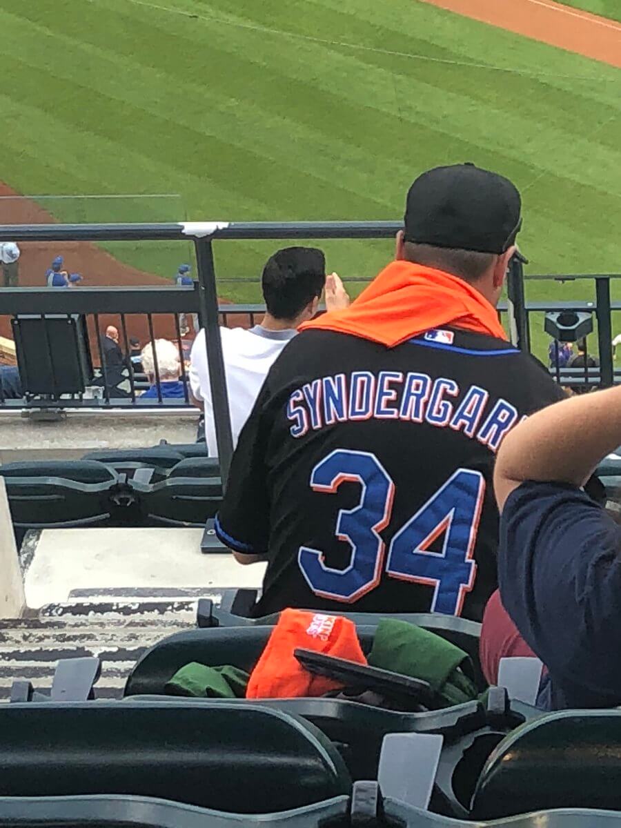
OK cool, I get it. Looks nice with a hoodie and a pair of jeans.
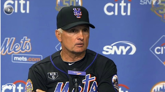
But this is what a black uniform looks like on the field.
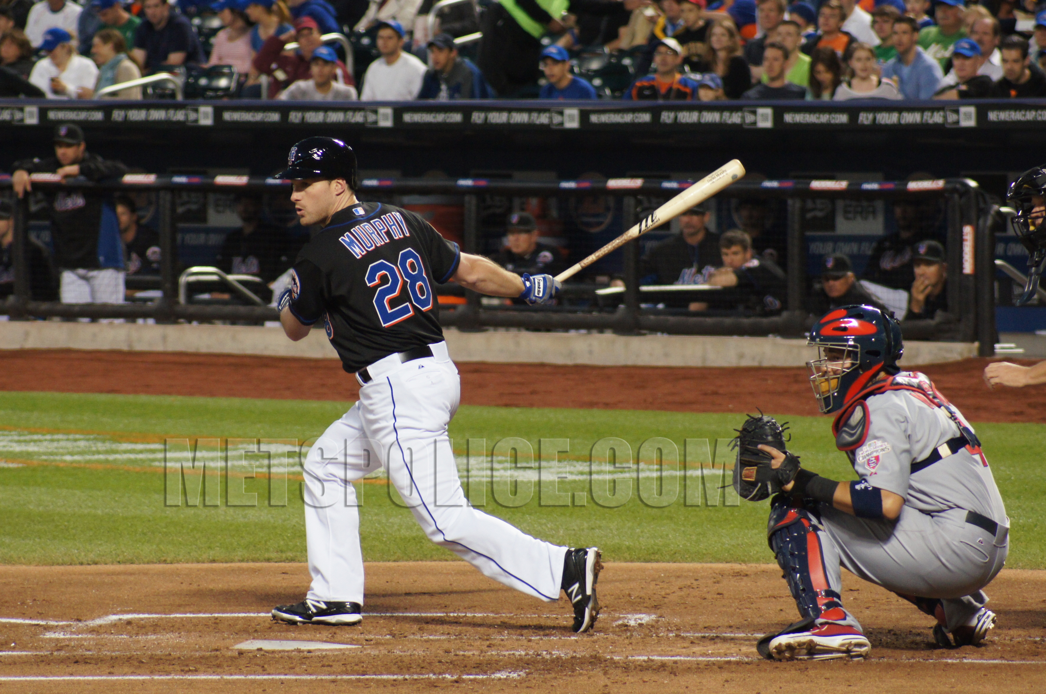
It looks bad and makes you look like a softball team, or maybe if the XFL started a baseball league. It’s bad.
This is what it looks like on a Captain, not some immature vulgar kid who shouldn’t even be considered as captain (yet) maybe hit a home run in your second spring training before we anoint you as great.
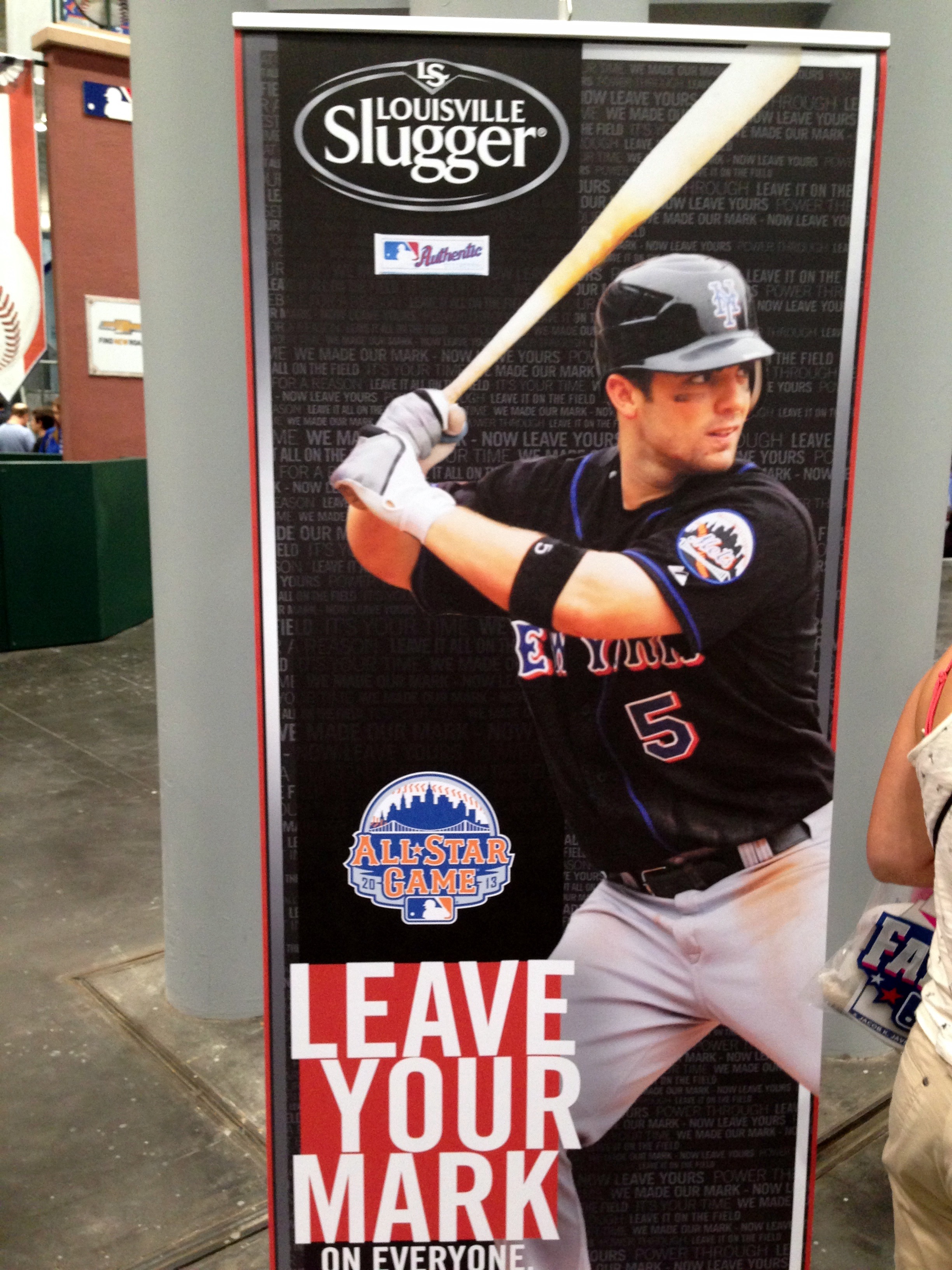
That looks terrible. Now as you youngsters doubt me…look at the above, and now look at the below.
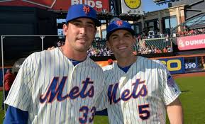
Then there is the headwear that comes with the black. Note how the NY disappears….
But even worse than the black cap is the hybrid cap.
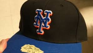
While it’s nice if you’re hanging out on thr street, it SUCKS on field. The NY totally disappears and the blue and black give the entire cap a “purple” optical effect.
But let’s get to the dropshadow. Look at Gilkey. Look at Hundley. Look how messy the fonts look….
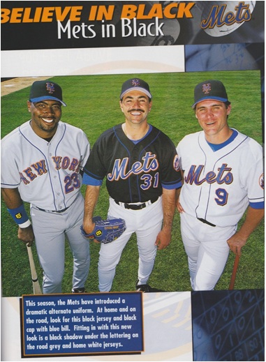
Compare that photo to these …(despite my blurry photography)
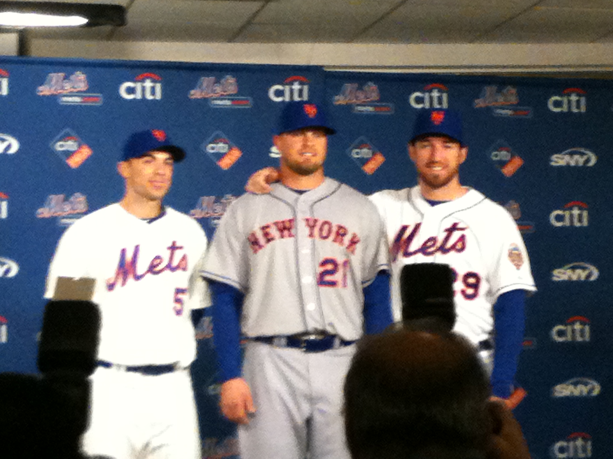
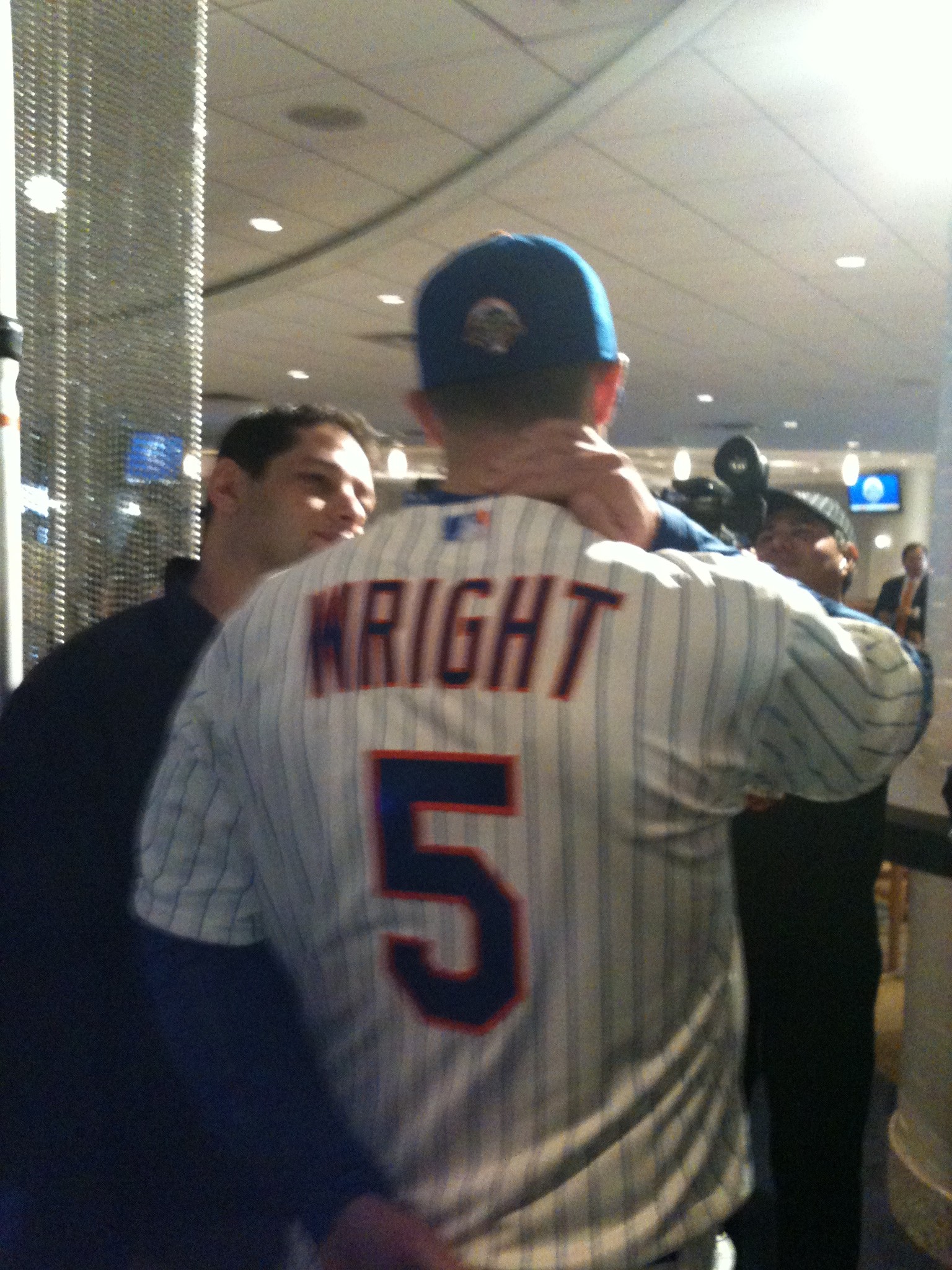
Sooooo much nice and cleaner….
Look at this comparison
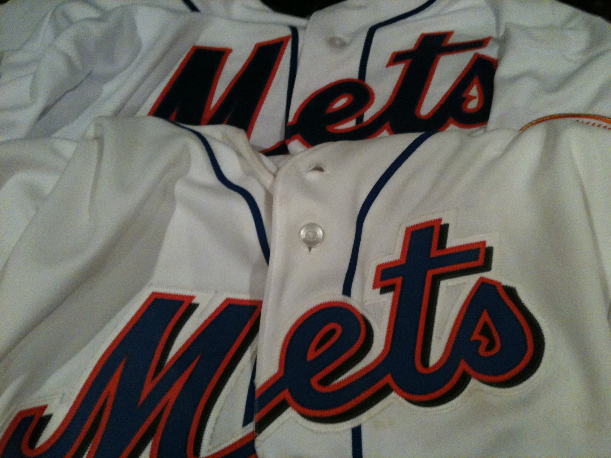
Dropshadow is THE DEVIL.
As horrendous as the black is, dropshadow is worse. It infected everything.
Stop the madness. Black sucks. Don’t listen to the idiots filling their editorial holes, and don’t listen to some kid who can’t even do Let’s Go Mets right.
The current uniform set is perfect (well maybe we should have blue squatchos) and let’s leave it alone forever.
