MLB makes everything worse: the new Mets numbers suck

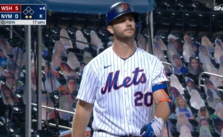
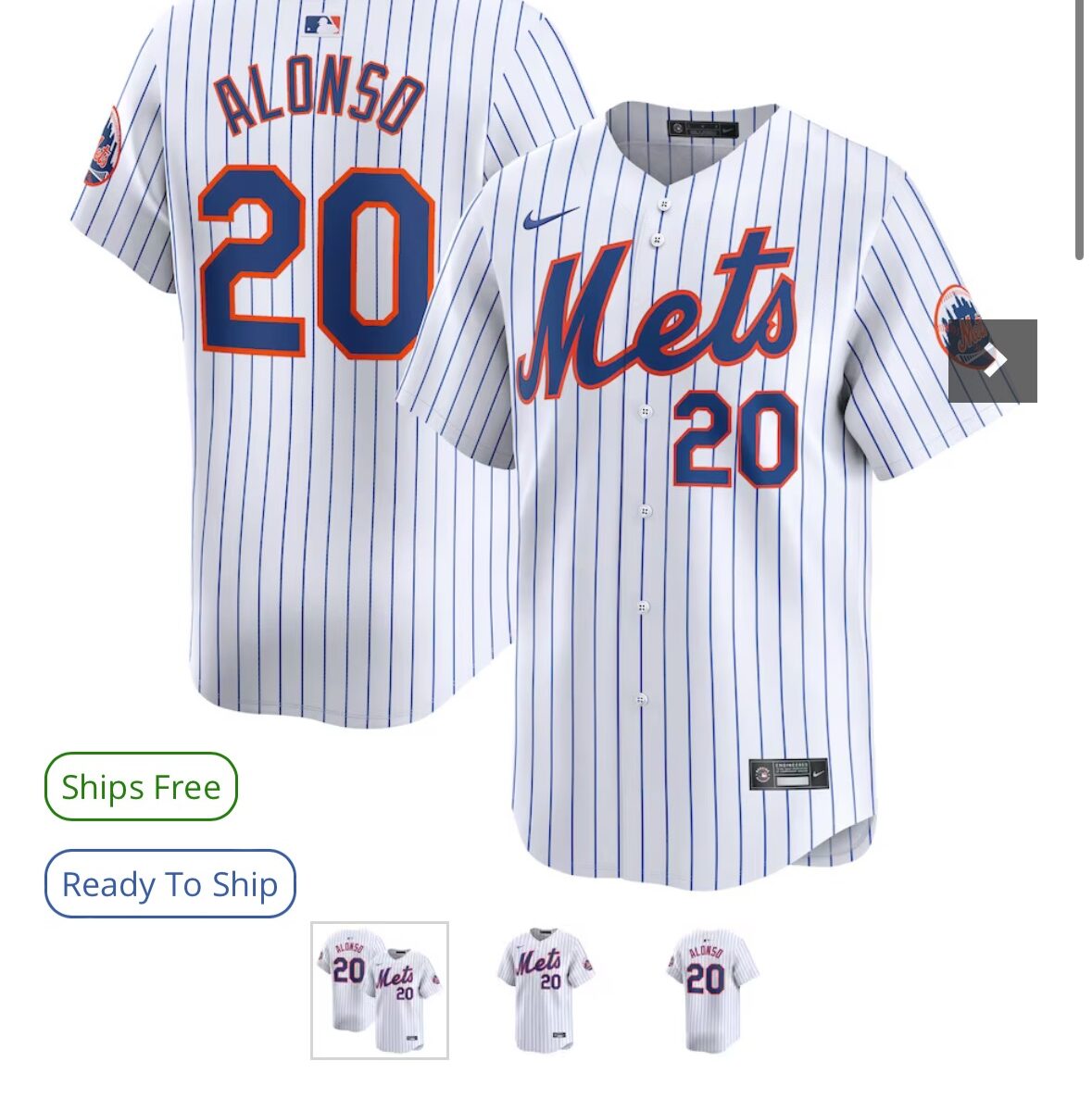
MLB made everyone switch to a standard number font.  Now Mets jerseys look like Chinese knockoffs.

NEW: note the skinny 20 on the front.  Also is it me or is the ETS leaning to the right?

OLD:  Look at the nice robust 20 as Pete walks back to the dugout after striking out yet again.

The Mets Police
Privacy Overview

This website uses cookies so that we can provide you with the best user experience possible. Cookie information is stored in your browser and performs functions such as recognising you when you return to our website and helping our team to understand which sections of the website you find most interesting and useful.