Strictly Necessary Cookie should be enabled at all times so that we can save your preferences for cookie settings.
If you disable this cookie, we will not be able to save your preferences. This means that every time you visit this website you will need to enable or disable cookies again.
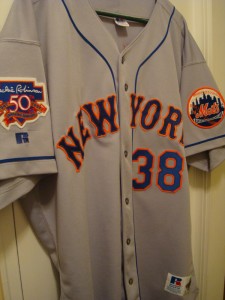
 That’s a good look. Who can tell me why?
Cause of that sweet Russell Athletic logo, right?
Wait a minute. Wait a minute. That jersey is ALL WRONG. They forgot the drop-shadow and added that silly little NY on the Mets patch. Shame on the Mets. 🙂
That is the sweetness. I’m jealous.
Dave Mlicki! The hero of ’97! The prize of my collection.
No black outline behind letters / numbers. I recently ordered a 1969 Jerry Koosman (my favorite Met) home jersey and while I really like it, dont think its 1969. I think mine is 1973 which is fine with me. The blue pinstripes in 1973 were much more deeper in color than in 1969.
Oh, man, I want one of those. Best. Mets. Jersey. Ever.
I want to know why, like, on the new jerseys, sometimes the baseball patch is missing a bunch of the stitches – esp near the top, and basically it was made by someone in a part of the world who doesn’t know what a baseball looks like.
maybe I answered my own question
doesn’t that uni looks so much nicer without the black? add some blue sleeves and a blue hat …. that would be a sweet uni today. ditch the black
That was always a sweet uni.
I wish they’d make that jersey again. It’s a crying shame. I want #42, for Willie Mays.
Get it done, Wilpon!
Like this?
P.S. Mays wore 24…
ha ha, you know, it hit me after I posted it, the wrong number. well that’s not my fault I’m not intelligent.
oh btw, I’m wearing a Zeppelin shirt, green and yellow 77 tour, so I got that part right.