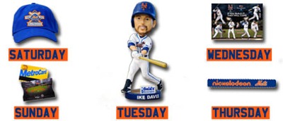
I have tickets to Saturday, don’t know if I can go, but need to own that cap.
And don’t forget Make Up Monday
Take advantage of this exclusive ticket offer for $7 Promenade Reserved and $15 Left Field Landing tickets to the 7:10 p.m. game this Monday against the Marlins at Citi Field.
Who is in the Fathead? I don’t see Jose.
Answering my own question: Bay and Ike on the top level
Lower level: Turner, Pelfrey, Murphy or Thole, Niese
No Jose. No Wright. No Beltran
hmmm…message received. 😉
Like that hat…I came pretty close last year to this exact patch design…mine is a bit nicer, but probably harder to stitch
https://metspolice.com/2010/09/01/mockup-of-2011-mets-patch/
BTW, I always post as Steve D, never as Steve.
It seems to be an exact copy of the 20th World Championship Anniversary logo. Just with “06” replaced with “11”, and the “0” in 20th replaced with a “5”
http://www.sportslogos.net/images/logos/54/67/full/ehiyf4fegkhi49zhf4yy.gif
While your’s was more of a replication of the teams 25th Anniversary logo. Which, I’d be willing to bet the 50th Anniversary logo next year will closely resemble http://www.sportslogos.net/images/logos/54/67/full/1224.gif
(double commented to get around the multiple URLs screening process)
FDD,
I look at these logos and patches, especially the older ones, as works of art. That’s why I am so annoyed that the little NY was taken off the Mets logo. The art reminds me of the past. My logo design, with the large 25, is much more like the original 1986 patch…I just slightly updated the original. The Mets sometimes do lazy, stupid or money grabbing things where they think they are “improving” on the original (like adding black to sell more jerseys, when in actuality they would probably sell more no black jerseys if they made one now…it would be fresher).
you can now do 5 URL’s up from two