Can’t argue with this. The Mets are gonna love that I kicked this can. Here is Steve.
Steve wants the Mets Wilpon script gone
Uniwatch did a piece on the current Met script awhile back…
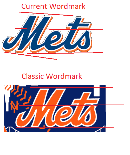
My picture better shows the absurdity of this travesty. No graphic designer worth anything would ever design this…
The M is so crooked in the current “Wilpon” font…the only thing that conceals that fact a bit is it is usually displayed on a slant. Please help correct this…it even ruins the jerseys. This script first appeared in 1995, when the Mets got rid of the horriffic underline and wanted the wordmark to look like it might on the new uniforms, probably to sell more jerseys. It has been propagated by uniform companies, especially by Majestic since 2003. This has to go as much as black does.
Steve D
Damn you Steve D (shakes fists of rage), now I can’t stop looking at it.
Once again, next year is the 50th anniversary – plenty of excuses to right all past sins and go back to the beginning when they had it right. Even the road number font.
Listen… I think the idea of the crooked script is actually as classic of a Mets design as possible (http://www.corbisimages.com/images/U1316066.jpg?size=67&uid=4b8ff065-67da-40c4-a41d-48e4ada7601e) …however, I do concur that this script should not show up on anything else other than the jersey. And I mean ANYTHING (like the “Let’s go Mets” sign at Shea Dos, press wall backgrounds, marketing booklets, etc)
The script on Casey is NOT crooked…it is slanted, yes. But if you rotate it level, you will see the the M is not crooked.
I’ll settle for going back to the 1995 uniforms. Home and road.
The whole “Wilpon script” conspiracy is a silly myth
There are clearly two E’s. I don’t think it’s a conspiracy, but it is inconsistent.
Nobody says it is a conspiracy…it is a change to a beautiful script that was made by somebody in 1995. It changed in a weird way, that my comparison shows the M is now on a different slant than the rest of the word. That’s not proper penmanship as I learned it. Uniform companies have propagated this “improvement”. I noticed this in 1995 and thought it looked stupid…now with the social networks, I can express my feelings. Many agree.
BTW, a few years ago, the LA Dodgers graphic design department had to issue a refresh of the Dodgers script because several different manufacturers had made incremental changes over time and the script had degraded. There is no shame in it. Just fix it.
the original logo and script shouldn’t EVER be screwed around with. It’s classic. Wilpons, stop screwing everything up.