Paul has some shots of the 2012 Topps collection…
I’m not crazy about the “surfboard” design Topps chose for this year, but it doesn’t really bother me. (Except for the players’ last names being printed in hard-to-read gold foil, that is.) I love the photography, though.
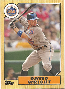
I’m partial to this one (because of the 1987 throwback design)
I also like that Paul has his Mazzy displayed in his page. (Paul won the 2011 Mets Police Blog of the Year Award).