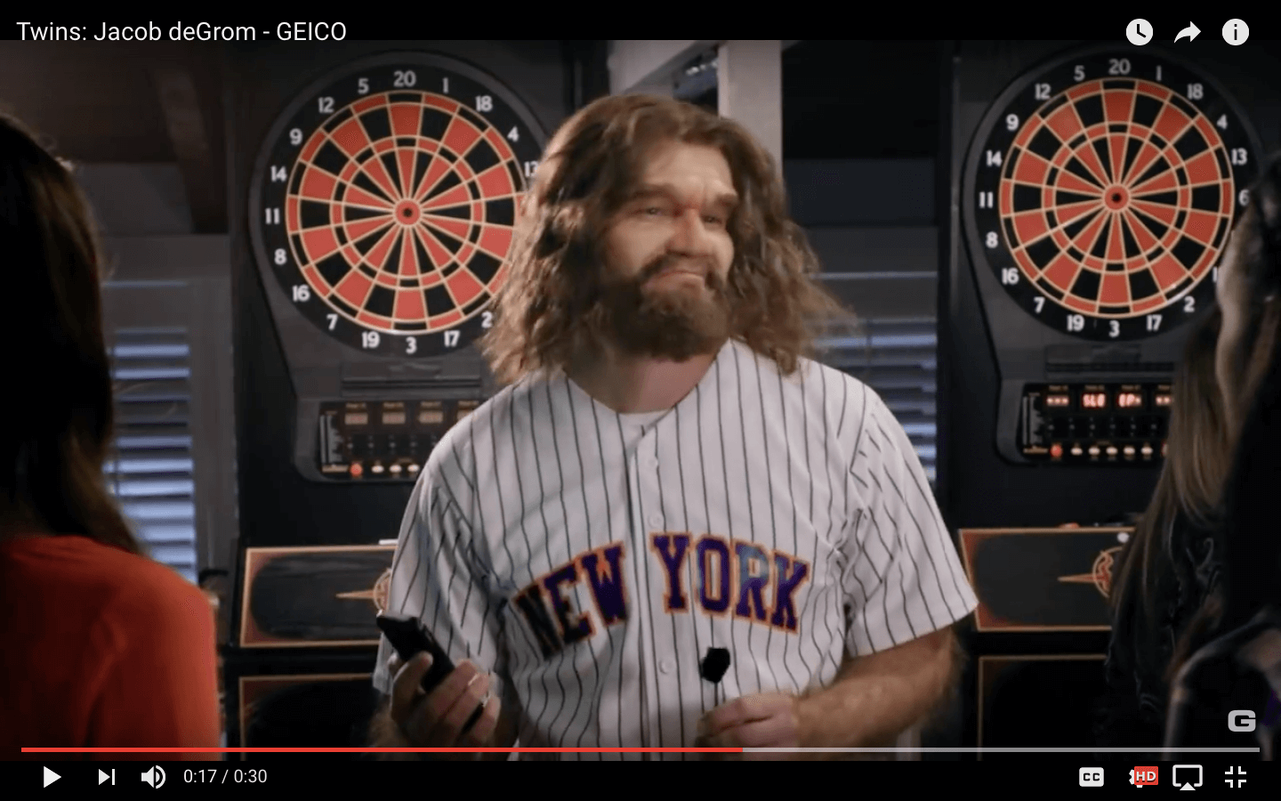
There’s a new commercial with a caveman that kinda looks like Jacob deGrom from the back.
First question – why would this dude get a Name on Back, no number deGrom jersey? Is there a term for this in Uni Watch parlance?

Next question – do the women think deGrom hangs out in a deGrom jersey, and when he does that he wears just his name?
Third question – where does Caveman get his jerseys? Why did they use an upside down P?

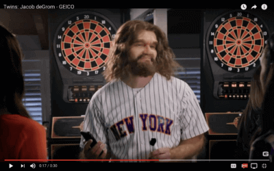
Now let’s look at the front. Interesting take on a NEW YORK jersey. This jersey is white and pinstriped, and has the city name in a fugazi font. Hmmm.

(Breaking character for a second, it’s kind of an interesting look and I wonder where this prop got made. I sort of want one.)
Finally, why is Jacob walking around in a generic cap? When he does wear caps why does he wear something so generic? Does he want to be recognized but doesn’t want to promote the Mets? If Batman did this…

Here’s the full ad so you can overanalyze for yourself.
